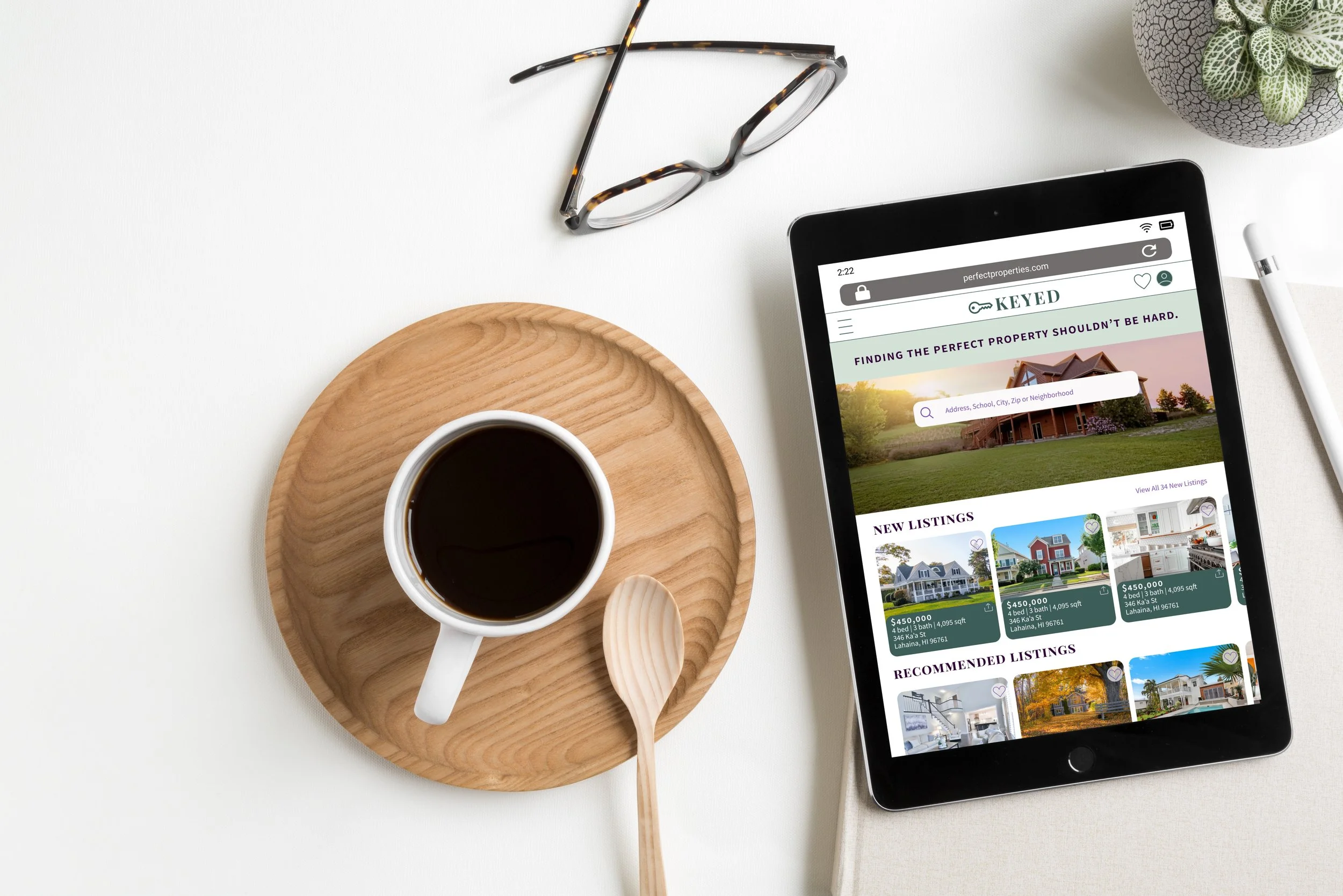
Keyed UI Case StudyFinding the perfect property shouldn’t be hard
Project Overview
A responsive web application that provides property buyers with information on properties of interest.
Finding the perfect real estate property, while exciting, can easily get complicated and overwhelming, especially as a first time homebuyer. Keyed was designed to simplify and streamline the process for the user based on the user goals and needs.
My Role :
UI Designer
Tools :
Figma | Marvel | Pen + Paper
User Persona & Flows
To begin the design thinking process, I focused on our user, Rashida, what her goals were and how best KEYED could accomplish those goals for her. From there I was able to craft user flows and then begin on some low-fidelity sketch wireframes with features and components that would help Rashida with her goals.
Rashida
42 | IT Consultant | Married | 2 Children
Goals
Rashida makes a good living and wants to invest in property beyond the city for increased financial security for her family.
She wants to find the right information for fast decision-making.
She wants a tool to help her find the right properties so as not to waste her time.
Quote
“I want to provide my family with financial security. I’ve been considering buying property for a while, and am looking for a tool that can help me find what I’m looking for, quickly!”
User Story | Flow 01
As a user, I want to create a profile containing all my property criteria, so that I am recommended results most relevant to me.

User Story | Flow 02
As a user, I want to be able to search and filter properties, so that I can find good matches based on my needs.

User Story | Flow 03
As a user, I want to be able to save or mark properties I am interested in, so that I can easily revisit them.

Style Guide
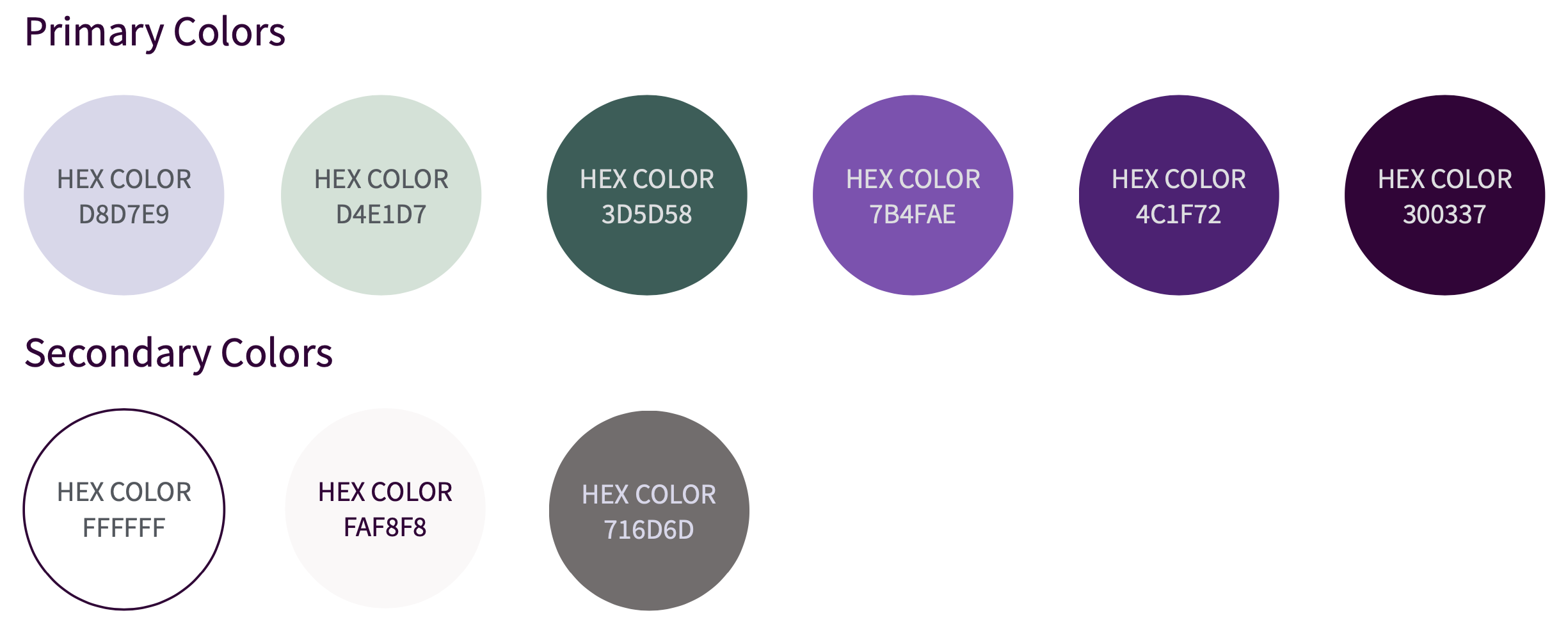
After mapping out my screens based on Rashida’s needs, I then focused on the UI elements that would bring KEYED to life for the user. Earthy greens and rich purples compliment one another for the color palette and give the app an elegant, sophisticated and modern feel. Typography is balanced with a serif and sans-serif font combination and icons are minimal and modern.
-
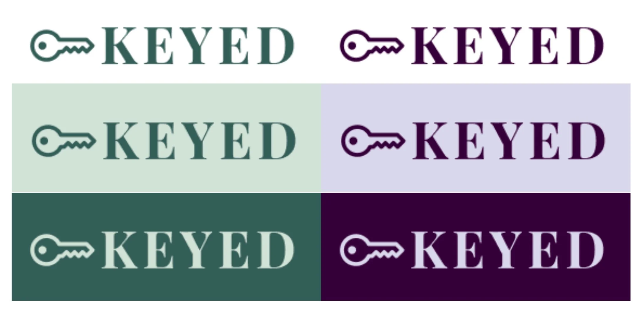
01 Logo
-
02 Colors
-
03 Typography

-
04 Iconography

Mid-Fidelity | High-Fidelity Wireframes
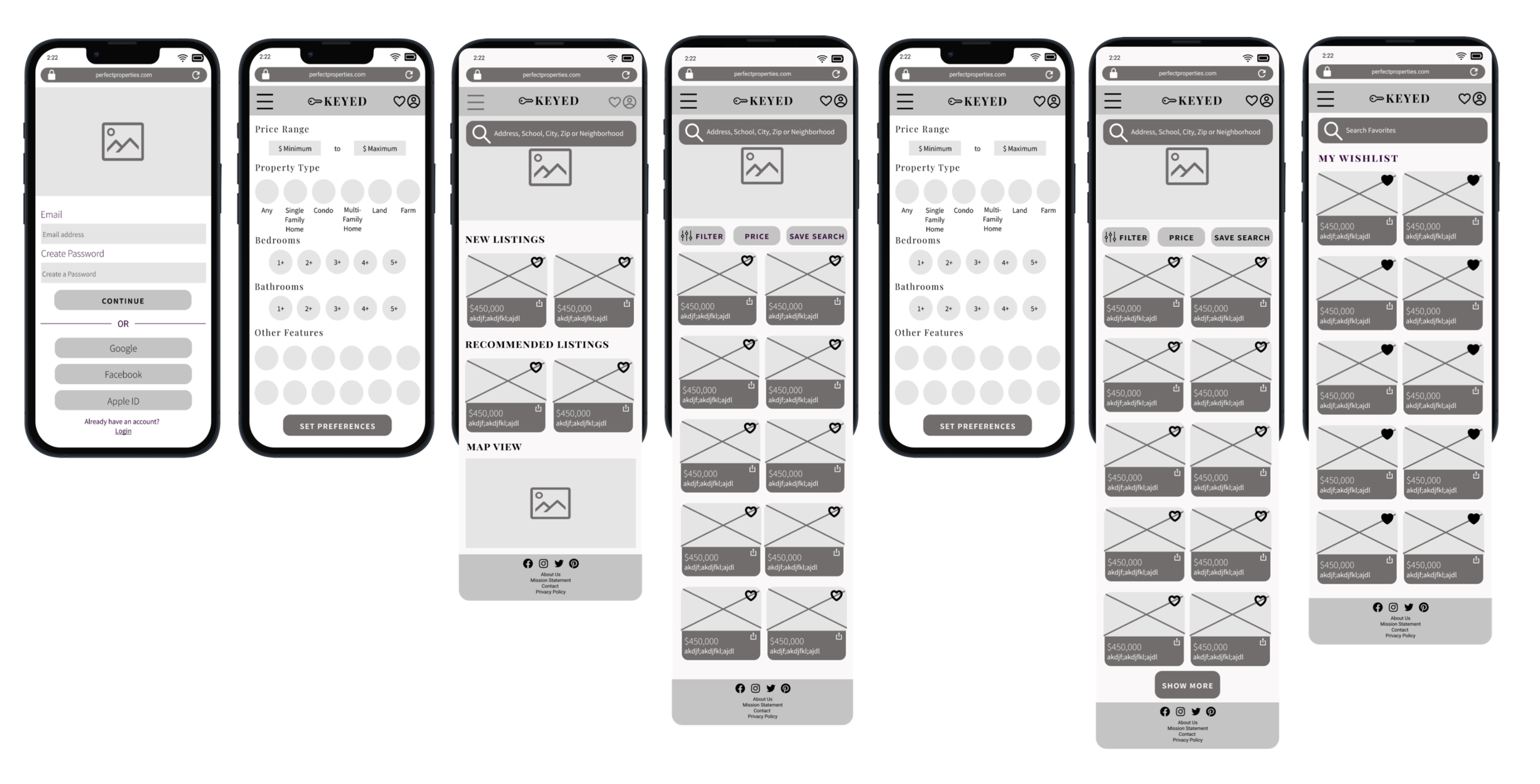
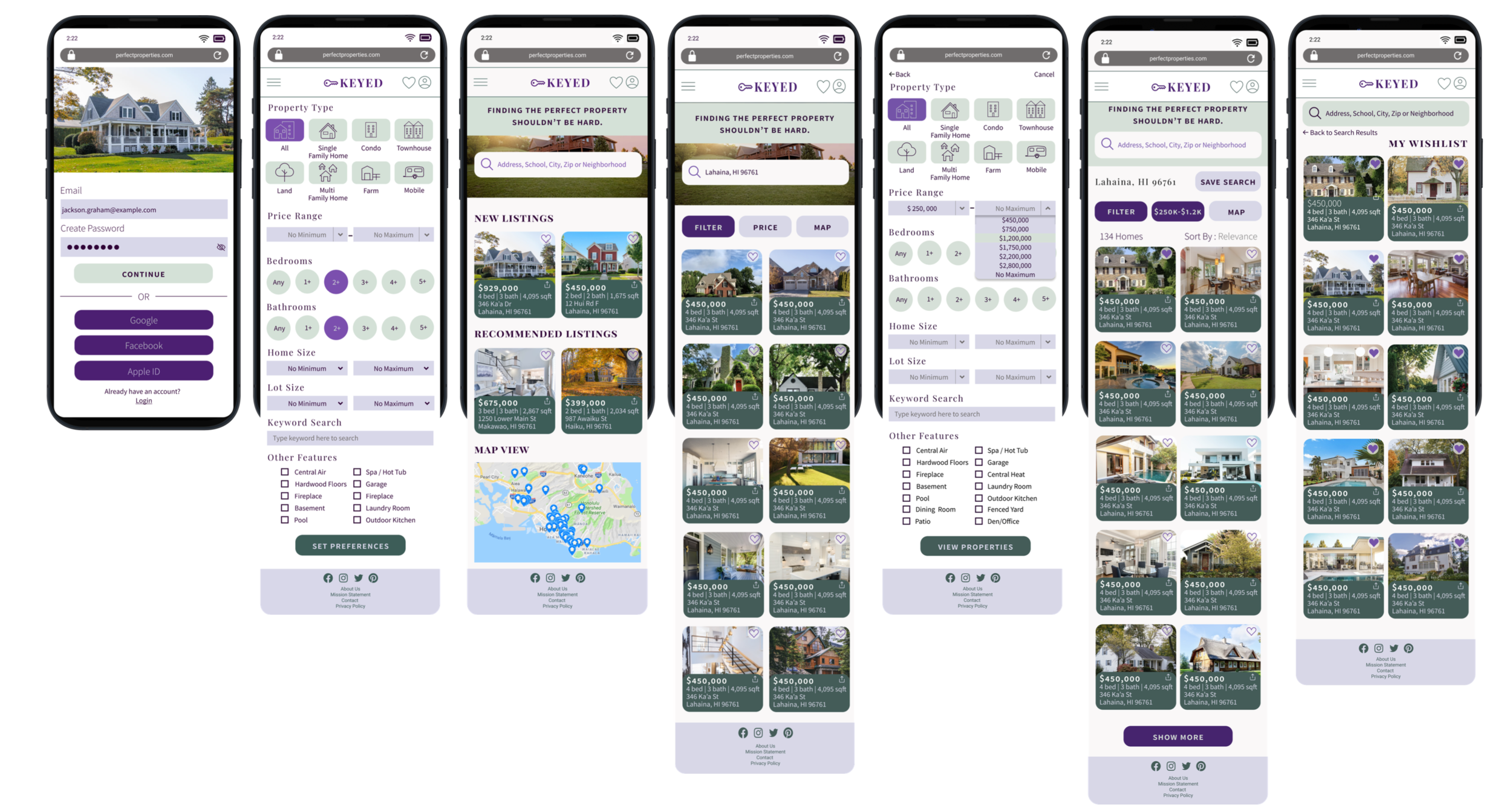
Here is a snapshot of how KEYED has progressed from the mid-fidelity stage to the final design.
Mid-Fidelity Wireframes
High-Fidelity Wireframes
Final Mockups & Prototype


Mahalo for your time!
