Vela Case StudyA RESPONSIVE WIND | WAVE | WEATHER APP
Vela Objective
Provide beautifully displayed and easy to understand wind, wave and weather reports, statistics and forecasts for sailors, surfers, divers and any other water sport aficionado.
-
My Role.
UX Researcher | UX | UI Designer | Product Designer
-
Tools.
Figma | UsabilityHub | Rainbow Spreadsheet | Optimal Sort | InVision | Pen & Paper
Understanding the Problem
The user needs a clean and visually appealing way to review and plan for upcoming wind, wave and weather conditions that are customizable and can notify of condition changes in real-time, because being unprepared for a day on the water can be dangerous and risky to the safety of the user.
We will know this to be true when we see an increase of user activity within the app and an increase of new users downloading the app.
Design Thinking Process
Competitive Analysis
Surfline
Surfline positions itself as “the most trusted name in marine weather and surf forecasting.” Offering the “best real-time surf reports including tides, wind, weather, long-range swell analysis” and hosts the largest network of live surf cams in the world.
Surfline is one of the most known surf forecast apps available. With a 4.7 star rating in the iOS App Store and 11k reviews, they are one of two of the most used surf forecast applications available. Their competitive advantage over their competitor is their live surf cams that allow surfs to check the surf out via their mobile devices.
Windy
Windy is a wind, wave and weather forecast app that provides accurate and detailed forecasts “made for professionals” and water sports enthusiasts, such as surfers, kitesurfer, windsurfers, sailors, fishermen and others. They have a large focus on connecting the windy community as well.
Windy is a highly regarded weather app within the professional community of watermen. Boasting the most accurate and in-depth weather forecasts based on NOAA weather monitoring data and incorporates all the world leading weather forecasting models. With a 4.8 star rating in the App Store and 38k reviews, they have a good share of the market. Their competitive advantage over their competitors is the in-depth detailed forecasts customizable by water activity and location, as well as their windy community that allows users to chat and share photos within the app.
Vela Summary
Target Audience
Vela is designed for anyone that participates in a water activity such as, surfing, windsurfing, fishing, diving, boating, SUP, kayaking, etc. As the app has such a wide variety of activities, the app is to be suitable for any age demographic, and will cater to those that are more novice and intermediate watermen and waterwomen.
Risks & Opportunities
Users rely on word of mouth reports and the practice of checking the conditions out in person, as the wind, wave and weather data can be complicated and overwhelming. There is a risk that we don’t capture the users due to the misconception that wind, wave and weather apps can be deceiving and often times inaccurate.
Due to this gap in the market, there is a high potential for an app that can offer reliable, visually appealing data that’s easy to use and can be customizable. This gap in the market is a big opportunity that hasn’t been able to captured yet.
User Surveys & Interviews
User Research Methods
I utilized a combination of user surveys and user interviews to begin my user research to ensure I reached as many different watermen and waterwomen as possible. Due to how different conditions affect the the variety of water activities available, and how they vary by location and preference, using multiple research methods was key to the success of this project.
After user surveys, it was important to gather qualitative data as well, to hone in on more specific needs and goals of the users that present themselves during the user surveys. I conducted 3 user interviews with varied skill and experience levels to get a well-rounded approach to my users.
User Interview Goals
To get more in-depth details about how users currently interact with a weather or surf app.
To dive into the why behind what users use within an app currently and why they need certain data points based on their activity
To find out more about how and what can be customizable to the user to enhance their experience within an app
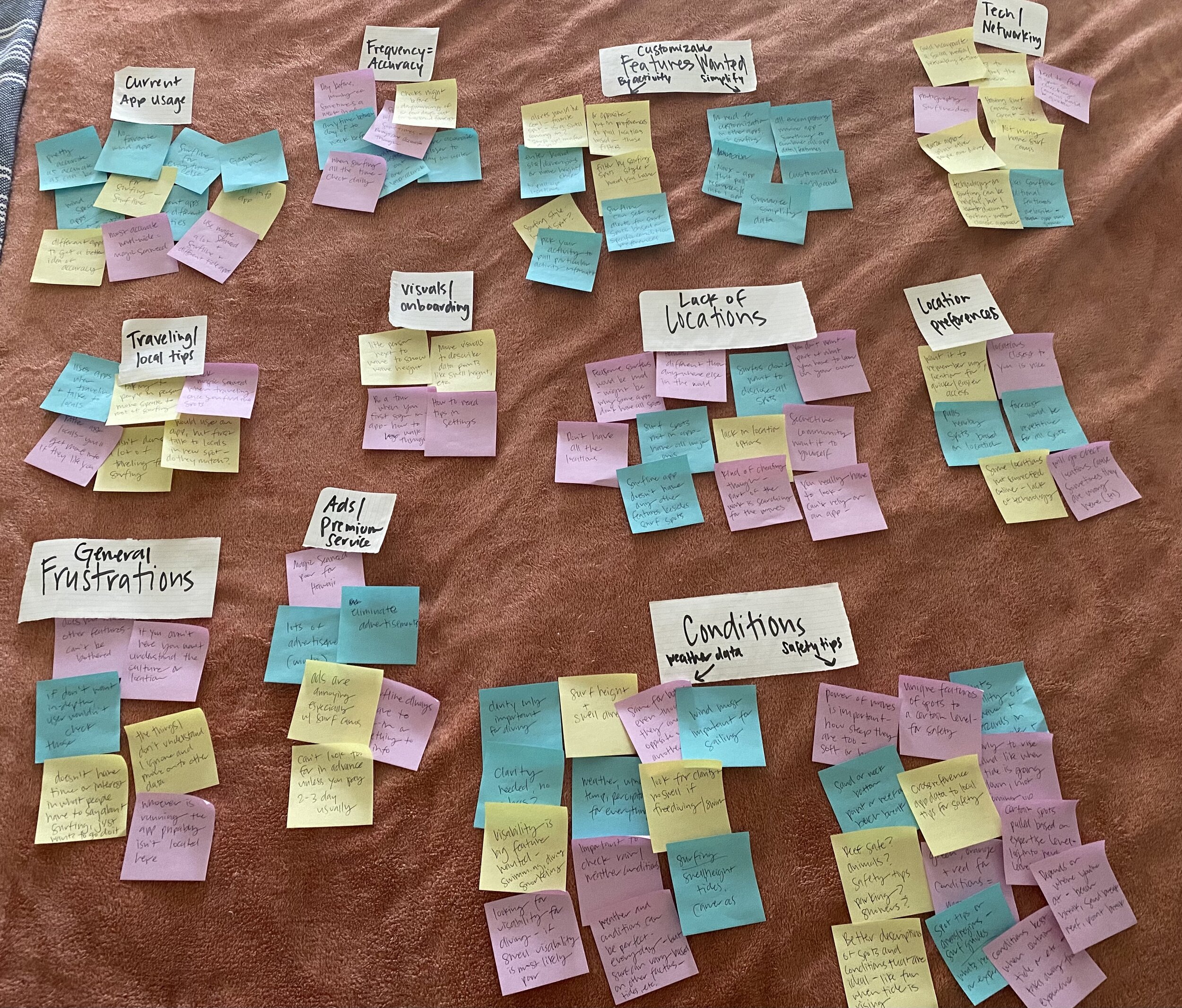
AFFINITY MAPPING PROCESS
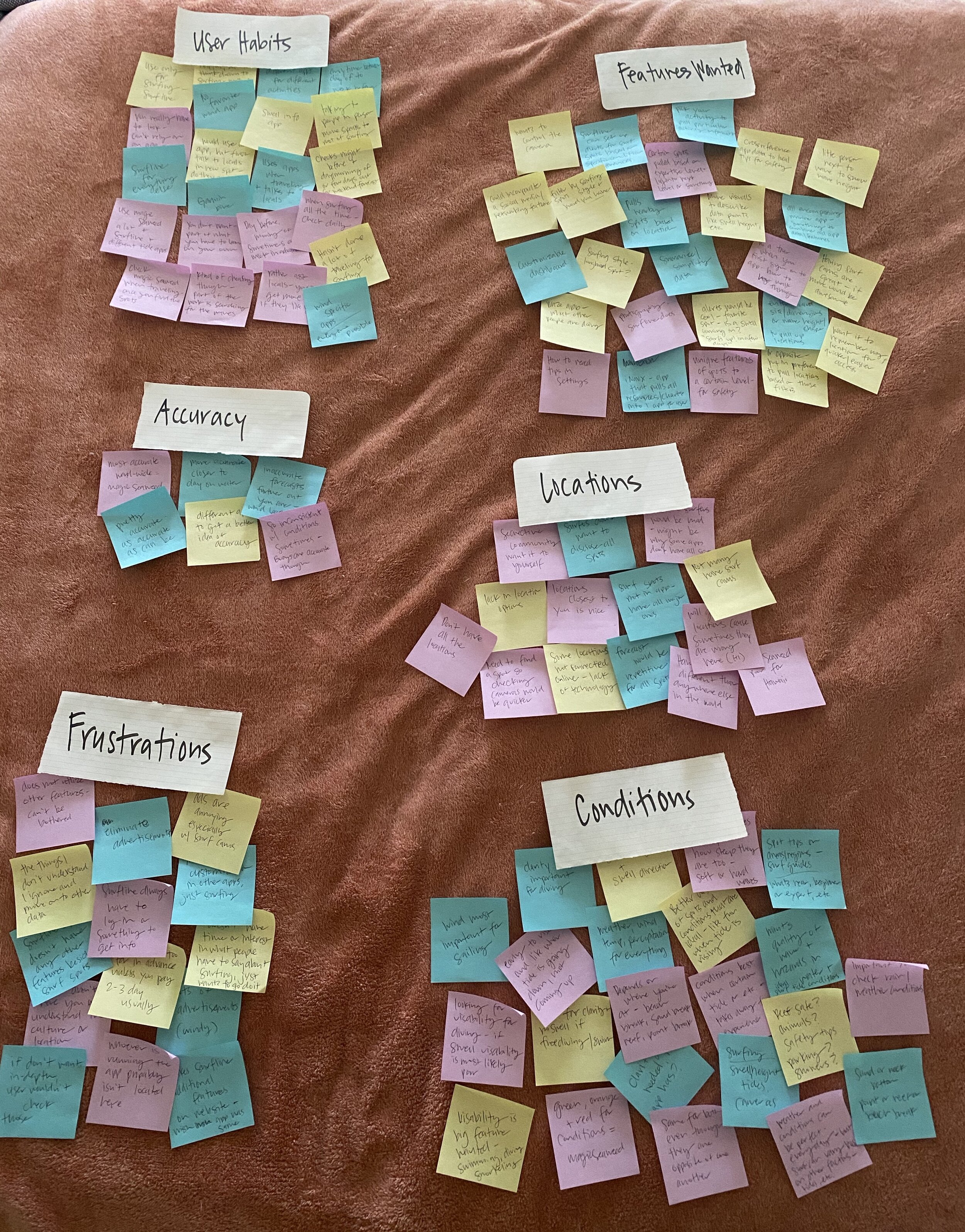
AFFINITY MAPPING PROCESS
User Interview Insights
-

Ashley
As an avid traveler, Ashley is a user who has experience using apps in a variety of places and new locations. She has been surfing for over 10 years and has extensive local knowledge of surf spots in Maui.
She also believes surfing needs to be experiential and that to advance in the sport, you have to do and not just see. She made some good points about how current surf apps are probably not 100% full of information, as it would most likely not go over well with the surf community, as surfers can be secretive about the best spots and where to go.
It was interesting to hear this from two different users, as the goal is to help inform users, not make the experience for surfing specifically, a poor one.
More surf cameras and better surf locations, including nearby spots to where you’re located, and safety/local tips are at the top of her want list for an app. She stated that you need to be able to see the water and conditions most of the time, not just read about them.
-
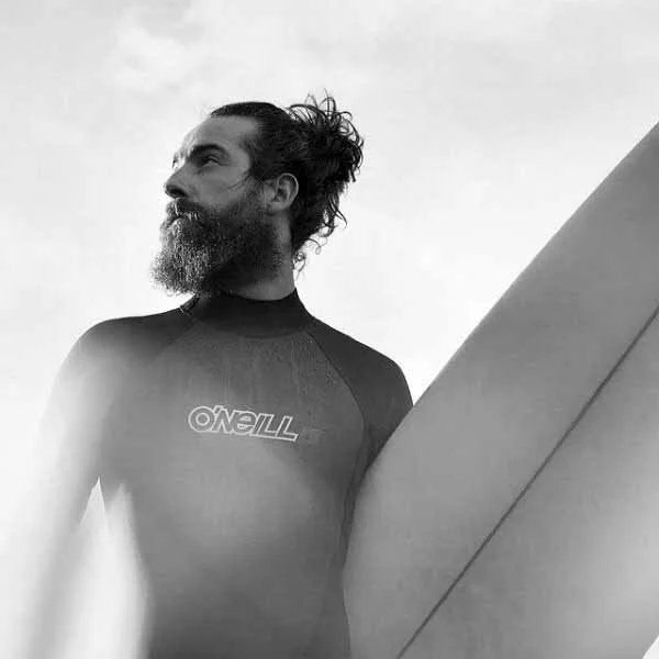
Dave
As more of an advanced waterman, Dave has a lot of knowledge regarding wind, wave and weather apps, so it was beneficial to see how he interacted with the apps used compared to more novice users that I interviewed.
As he is already knowledgeable regarding reading charts and graphs, he doesn’t struggle with the usability necessarily, however, he does use several different apps to get a well- rounded idea of the conditions, as he stated that was one of the only ways he felt he was getting a good accurate picture of what the conditions looked like.
As a premium service user of Surfline, he has access to a lot of additional features and extend forecasts, and is more than happy to pay for these additional features and benefits.
His notes and comments regarding additional features or improvements were in-line with what I had in mind for Vela, so this was good reassurance that the users want more customizable features, more surf cams, and more safety/ local tips regarding spots that align with experience level.
-

Krystle
Krystle is most novice user that I interviewed, as she only utilizes Surfline for surfing, and not every time she goes to surf.
She focuses on the swell and wave height, tides and wind speed when she utilizes the app, but nothing else. She wasn’t aware you could set your location to access spots more quickly and easily, or that you could save favorites.
Her approach to surfing is more organic that what an app can offer her, she enjoys going to check the surf and watching the water conditions before choosing a spot, she feels it is all part of the surfing experience and that an app can’t offer her that.
She does utilize the app for checking conditions ahead of time, as she likes to plan her weekends and get excited about a swell that may be coming in.
In regards to enhancements or improvements, she would like to see more surf spots covered, more surf cams, safety tips for new spots and had the thought that incorporating a Waze app type of feature where people’s comments gave you a better idea of the surf conditions, would be a really great feature.
USER PERSONAS | JOURNEYS | FLOWS
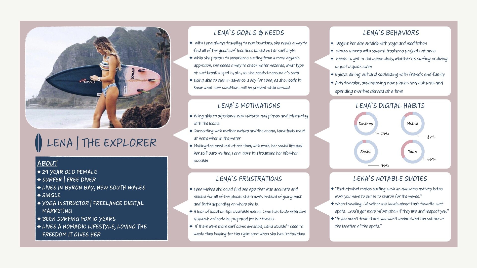
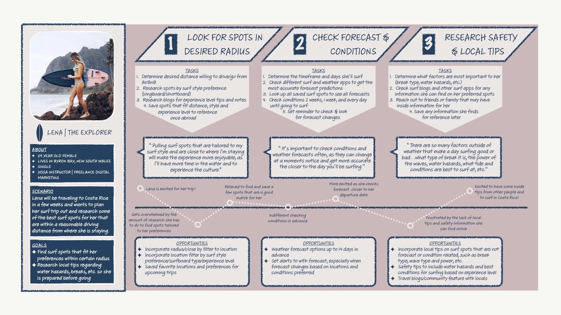
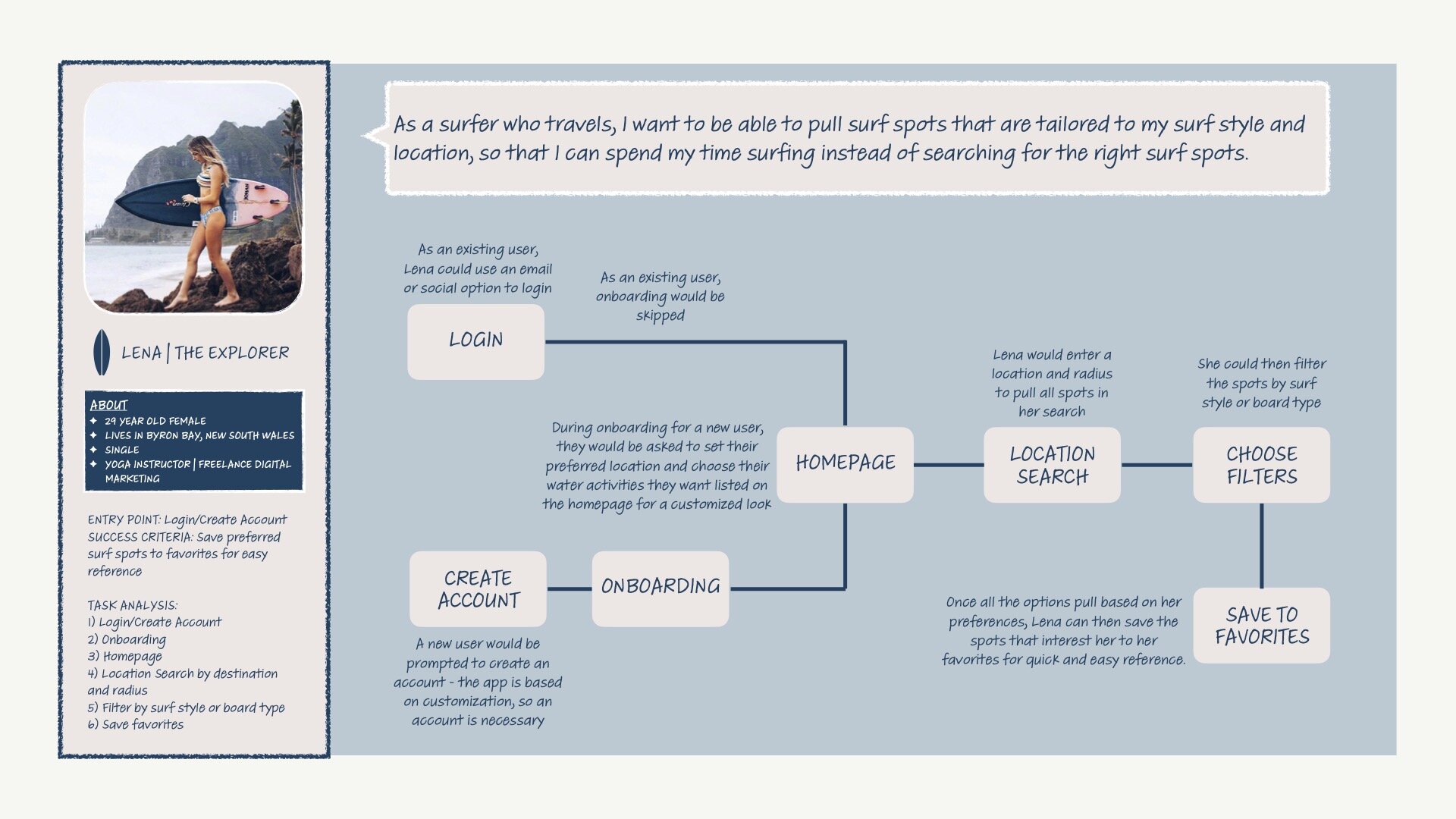
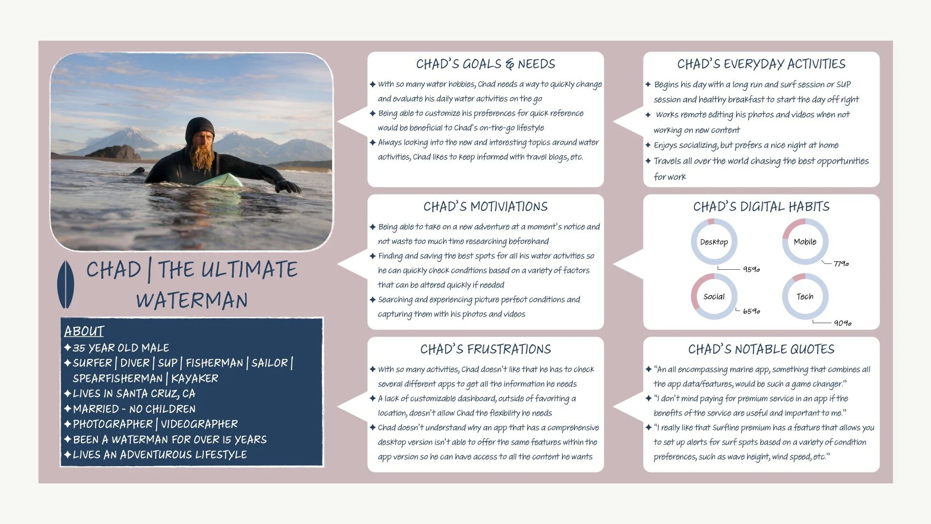
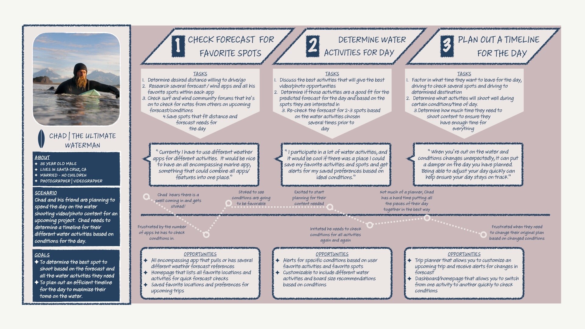
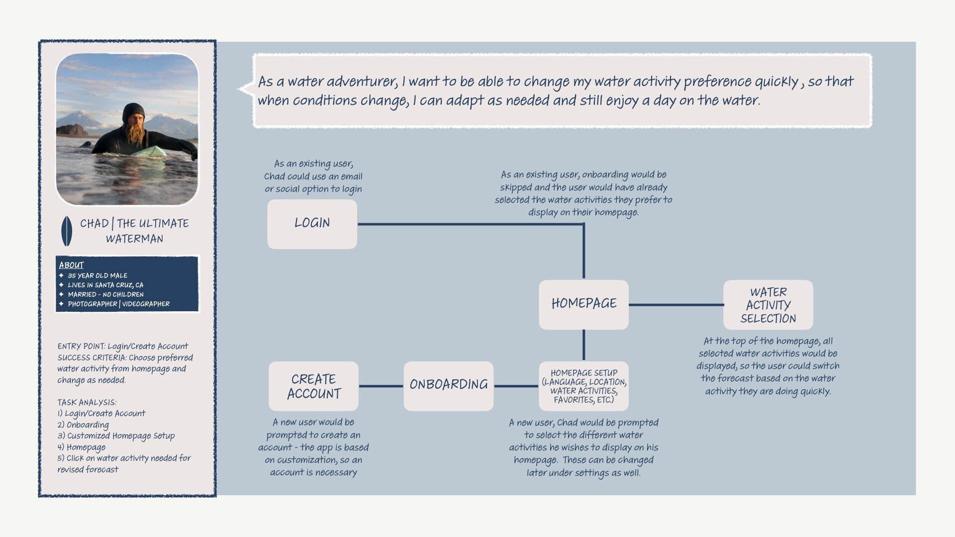
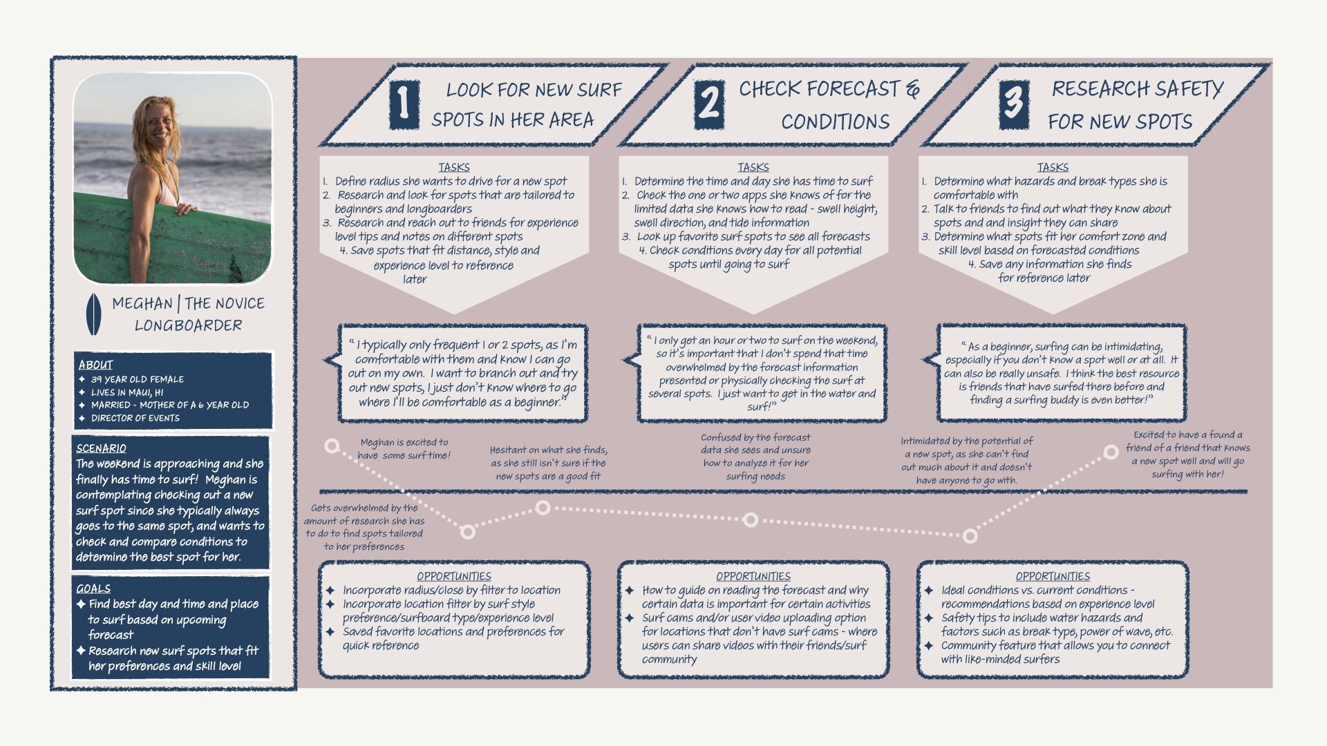
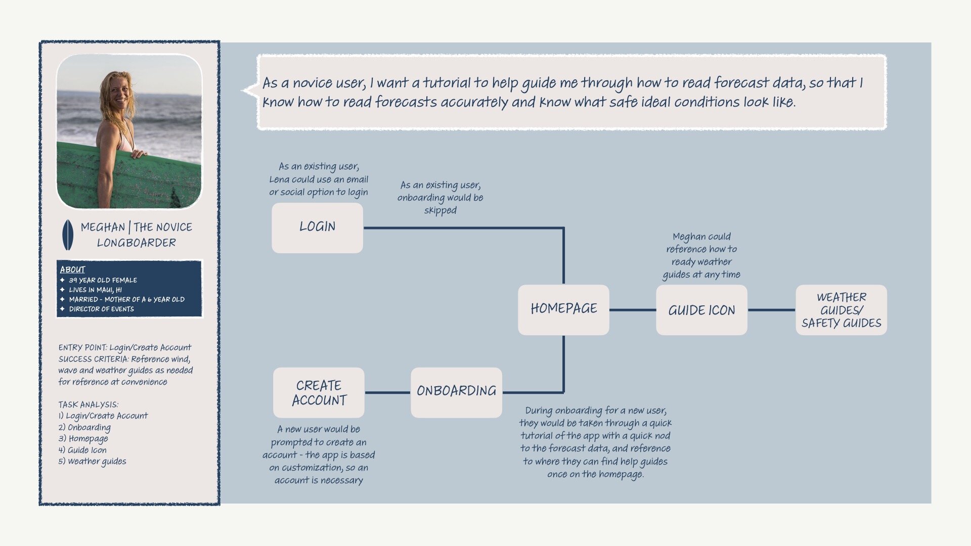
From user interview insights, I was able to create three user personas based on the different users I felt VELA would appeal to. Lena, the explorer that is always on the move and looking for her next adventure; Chad, the ultimate waterman that likes to spend the majority of his free time on the water doing a variety of different water activities; and Meghan, the novice longboarder who is new to surfing and wants to just cruise and enjoy the time she has on the water. Scroll through each user below to see their user journeys and user flows.
LENA | THE EXPLORER | PERSONA
LENA | THE EXPLORER | JOURNEY MAP
LENA | THE EXPLORER | USER FLOW
CHAD | THE ULTIMATE WATERMAN | PERSONA
CHAD | THE ULTIMATE WATERMAN | JOURNEY MAP
CHAD | THE ULTIMATE WATERMAN | USER FLOW
MEGHAN | THE NOVICE LONGBOARDER | PERSONA
MEGHAN | THE NOVICE LONGBOARDER | JOURNEY MAP
MEGHAN | THE NOVICE LONGBOARDER | USER FLOW
PROTOTYPE
Sitemap
After creating an initial sitemap for VELA, I conducted a closed card sort to touch base with users and ensure that my placement of tasks within the app were going to be easy to find and use. While a lot of the card sorting was spread out among different categories, most of the cards had a majority or equal majority in the category I had previously placed them in for my initial sitemap.
There are a few tasks that spoke to the content I intend to have on a specific page, such as homepage/dashboard, so the card sorting was helpful in making sure my users were thinking similarly to where they could find this content and how I intend to create the pages.
I did make a few adjustments, adding some different sub-categories under Favorites to incorporate the users having an option to save videos as well as spots to this category. I also added video uploading and local tips to the community category.
Low & Mid Fidelity Wireframes
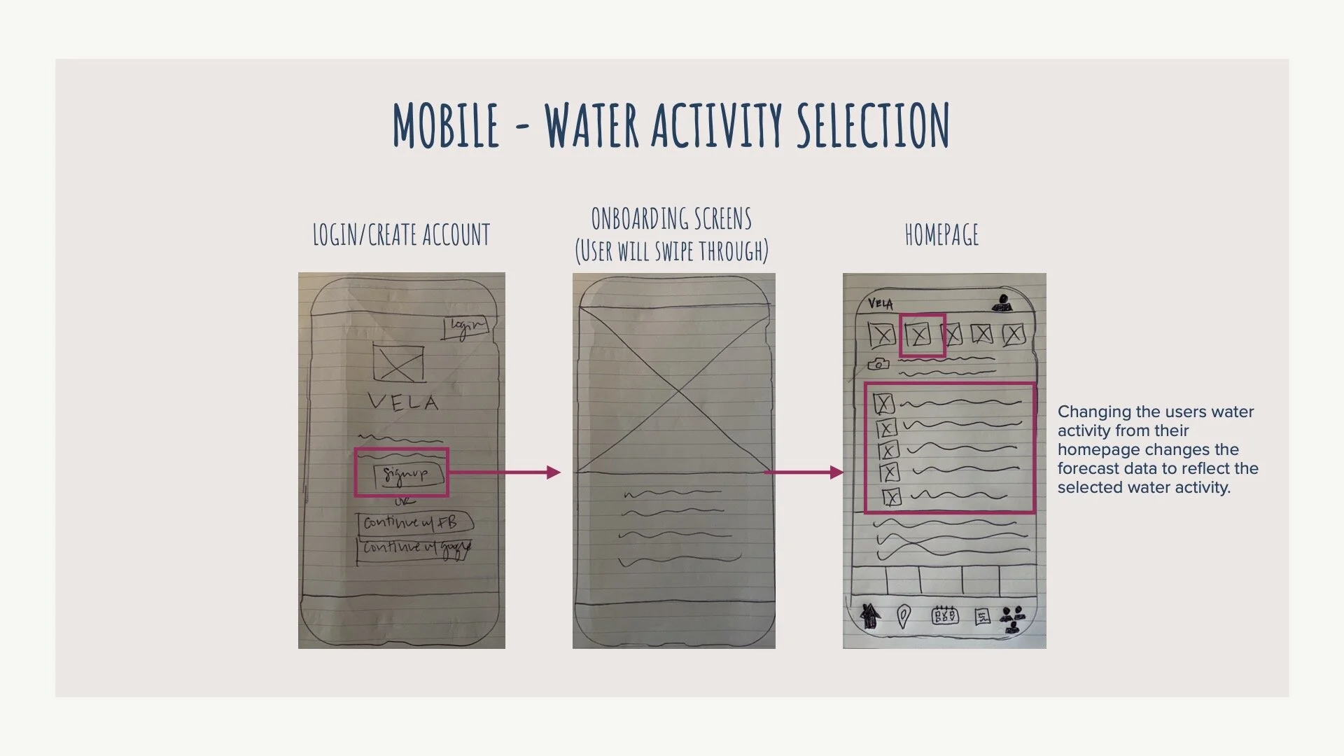
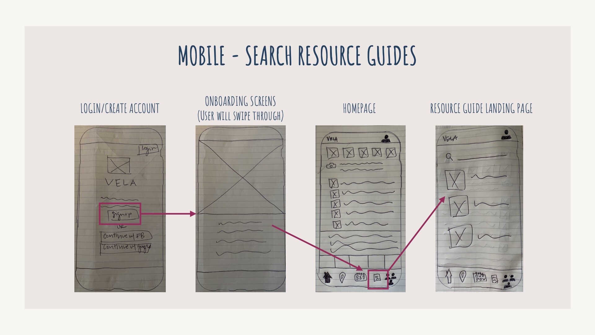
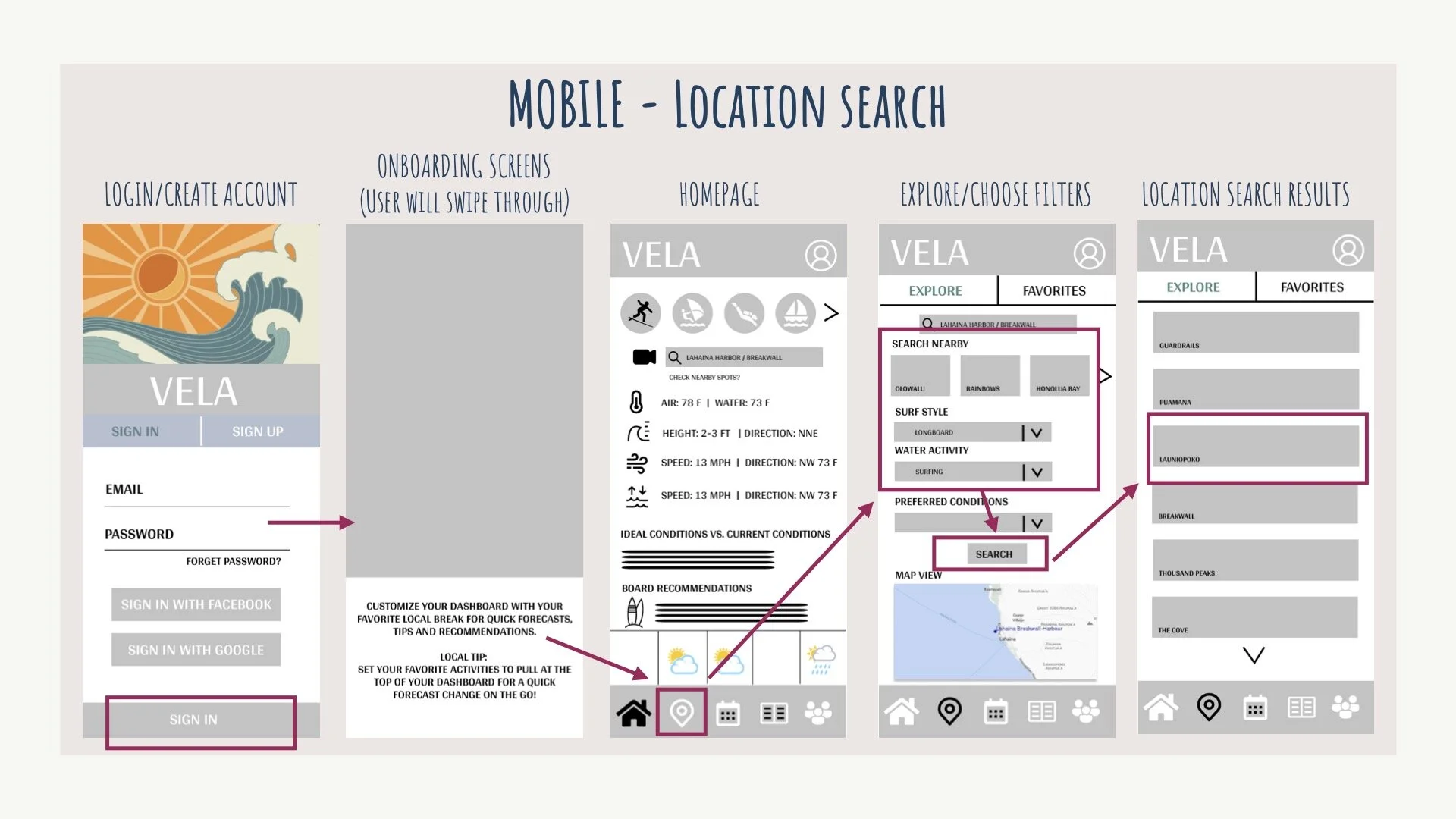
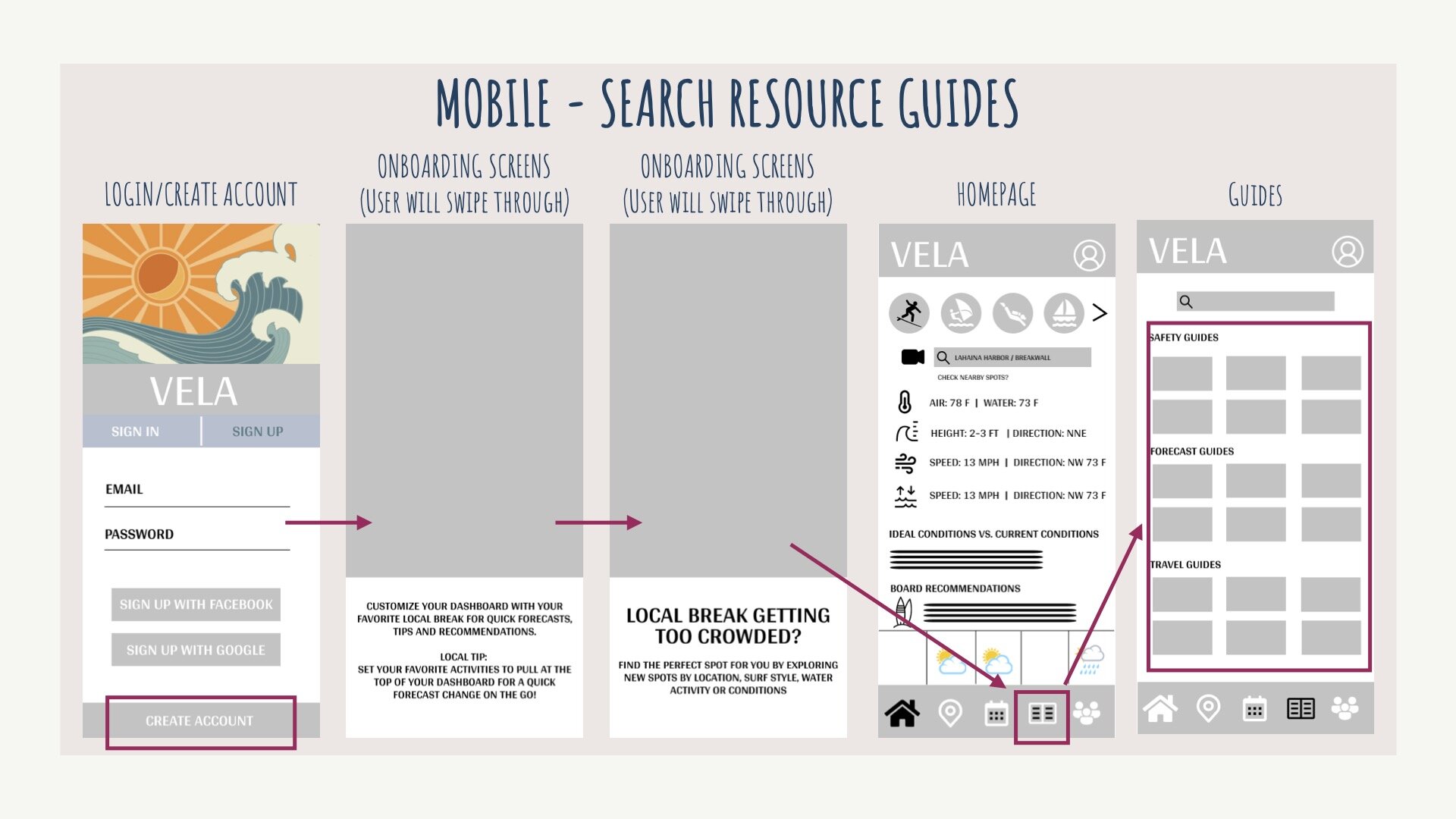
Going back to the user flows of Lena, Chad and Meghan, I then began the prototype process of creating low-fidelity wireframes for each user flow using pen and paper. From there I began utilizing Figma to create mid-fidelity wireframes. Below you can see the wireframes and beginning of prototypes for the user flows created earlier in the project.
USABILITY TESTING
With my mid-fidelity wireframes, it was now time to put my prototypes in place for users to test and receive feedback. I conducted usability tests with 6 participants all using either a moderated remote or a moderated in-person approach. Due to the pandemic, I was limited to the number of participants willing to participate in moderated in-person testing and utilized video technology to record where needed. Below is a snapshot of the testing process and it’s resuts.
Usability Test Scenarios & Tasks
1) You’ve decided to spend the day on the water and want to check the forecast for your favorite location for both surfing and kite surfing to see what the conditions are for both activities and decide what activity would be best for the day. Using the VELA app, check the forecasts for both of your preferred activities based on your homepage saved location.
2) The weekend is almost here and you finally have time to surf! You love your favorite break, but as a novice surfer, you are interested in checking out other spots nearby that would be possible options to explore. From the homepage, explore other nearby locations that would be good for longboarding.
3) New to surfing, you aren’t very familiar with the wind, wave and weather data that is presented and want to familiarize yourself with the terminology and data to ensure you are being safe before getting in the water. You read a few tips during the onboarding process of VELA, but can’t remember everything that you read. Using VELA, find tips and guides on how-to read and interpret the forecast.
Affinity Mapping & Rainbow Spreadsheet
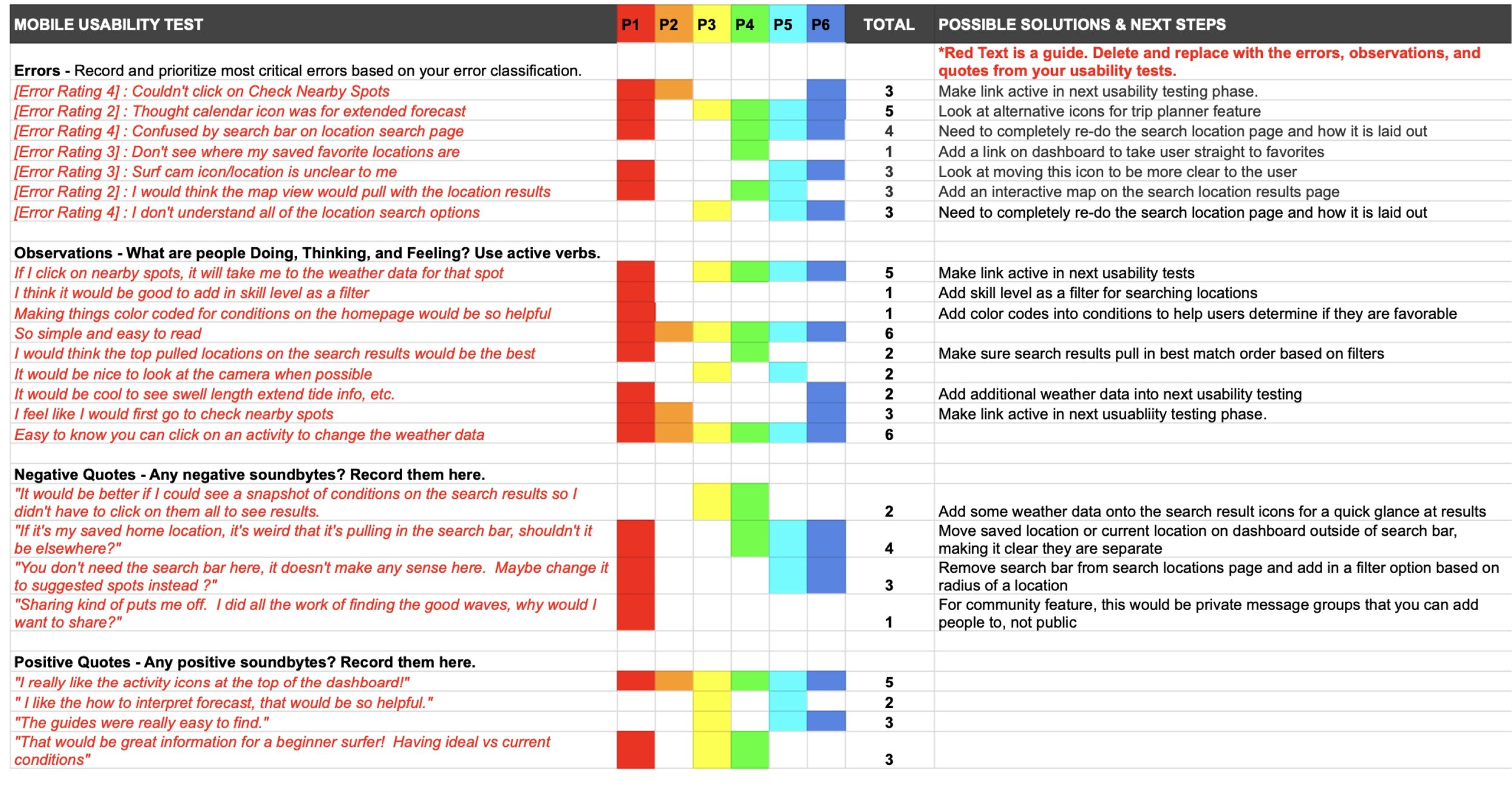
After conducting usability testing with 6 participants, I was then able to gather all of the details and sort the findings into observations, errors, positive and negative quotes. I used affinity mapping and the rainbow spreadsheet to sort my findings and start discussions of possible solutions and next steps in improving VELA. You can view the screenshots of my usability test results and reporting, as well as, my usability text plan below.
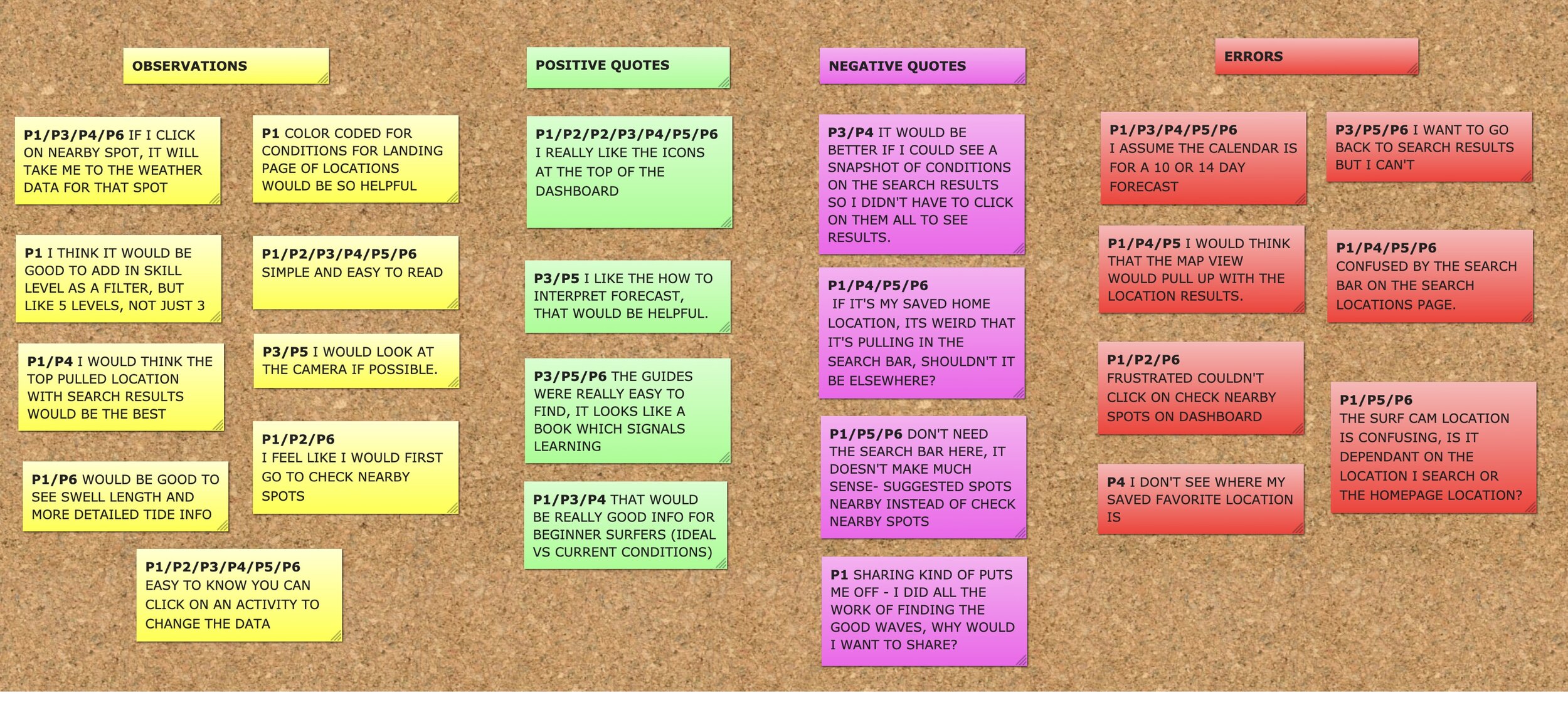
AFFINITY MAP
RAINBOW SPREADSHEET
Usability Issues
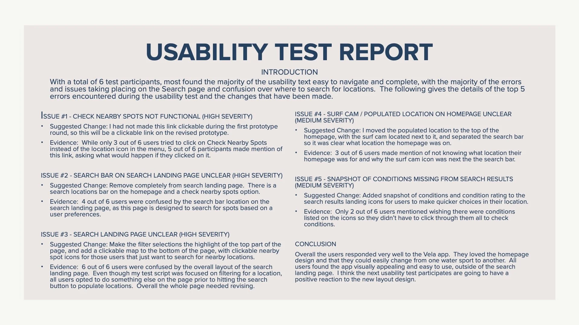
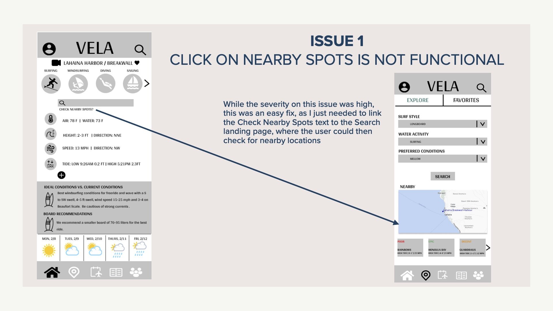
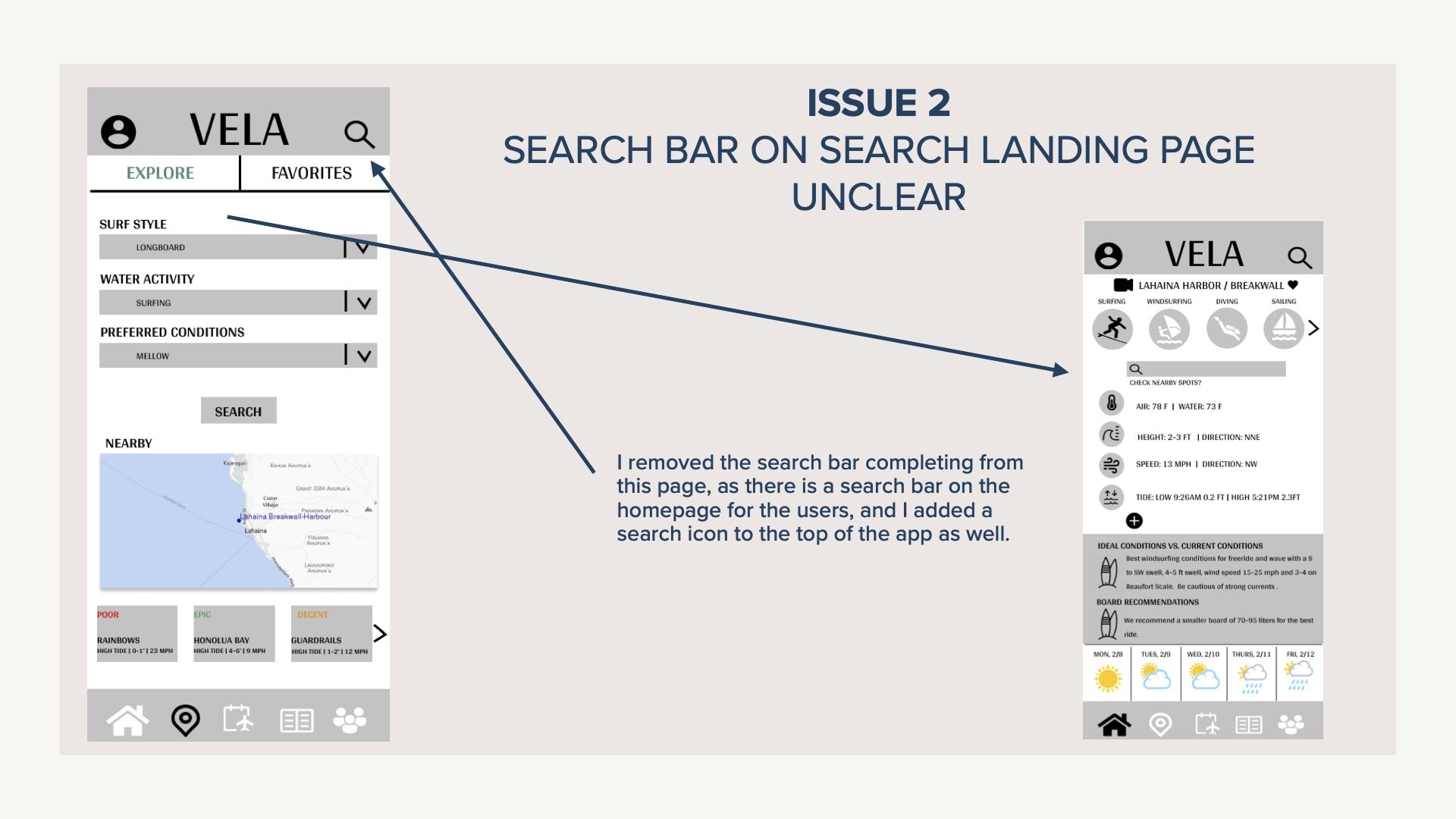
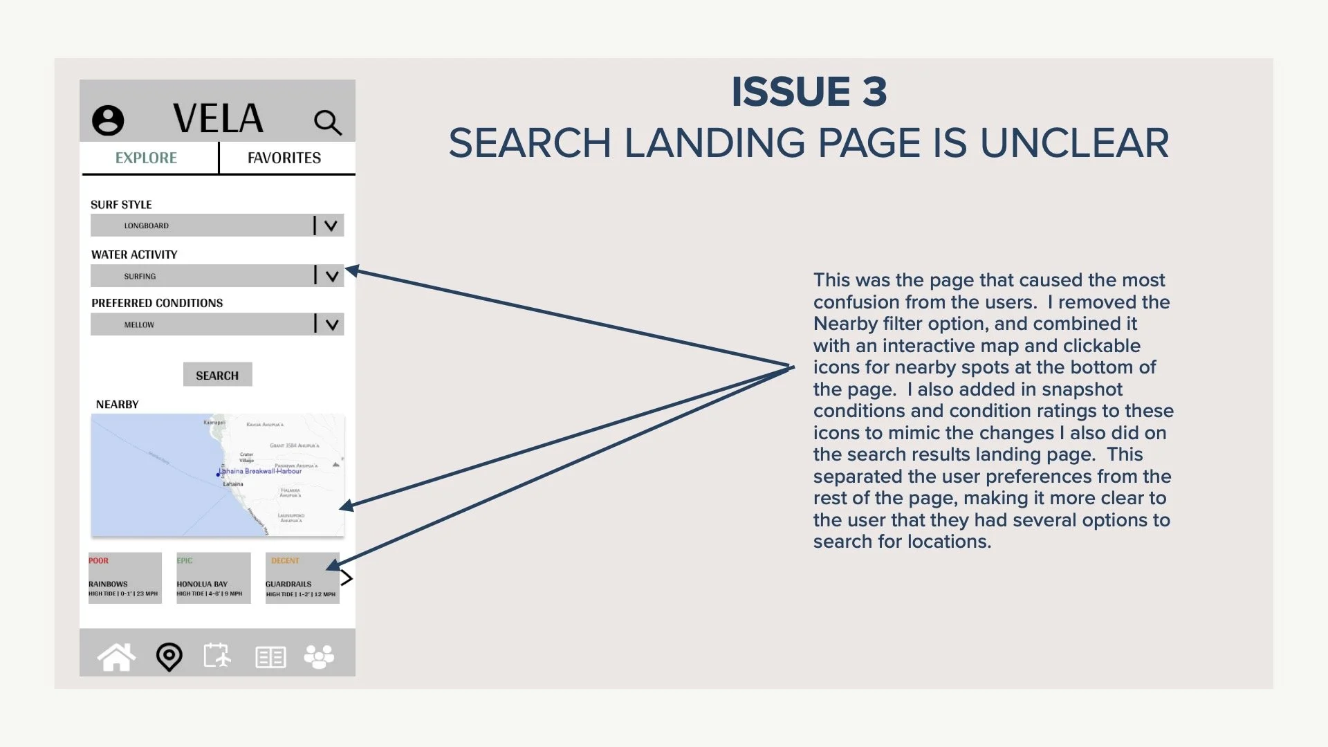
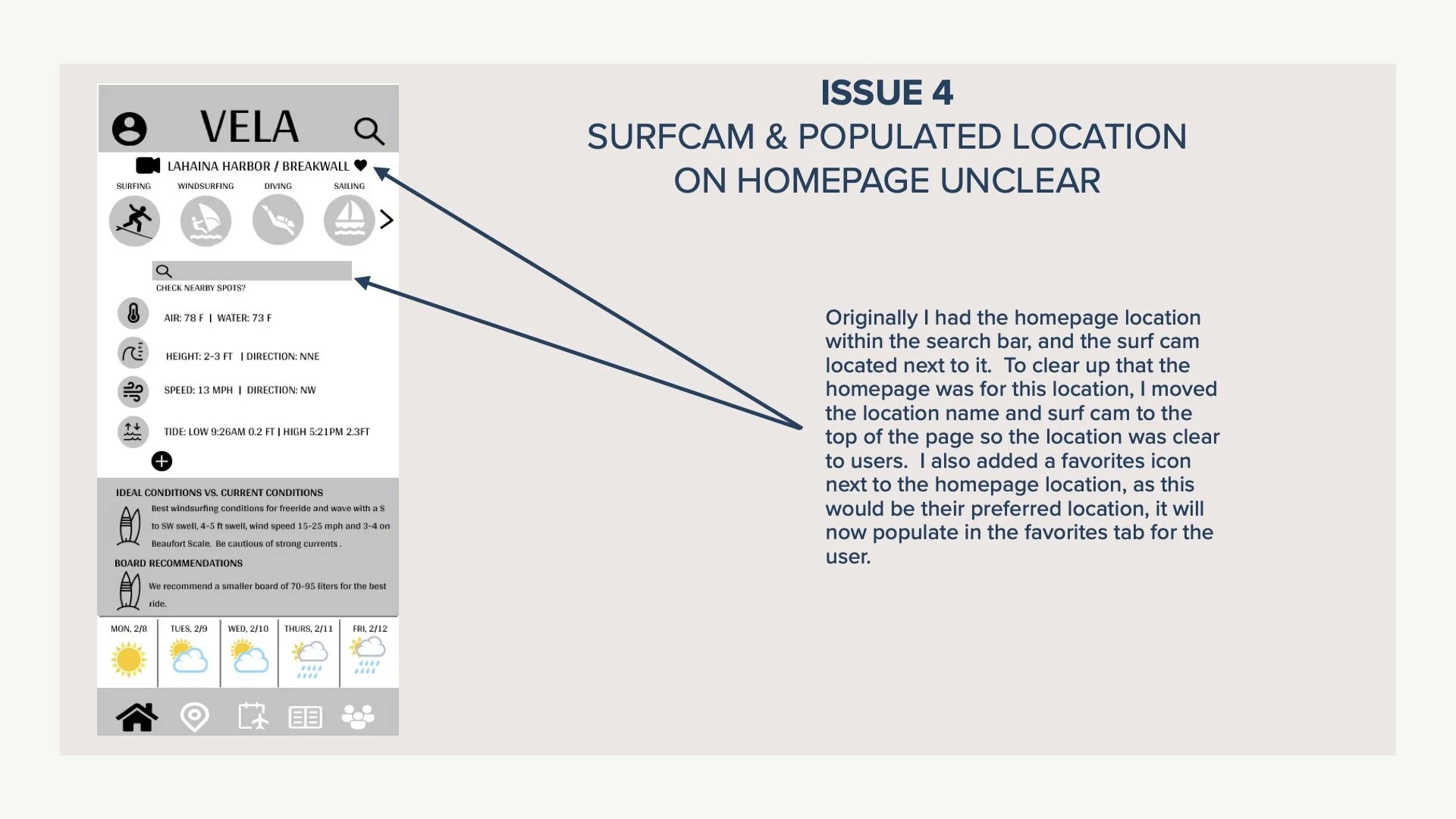
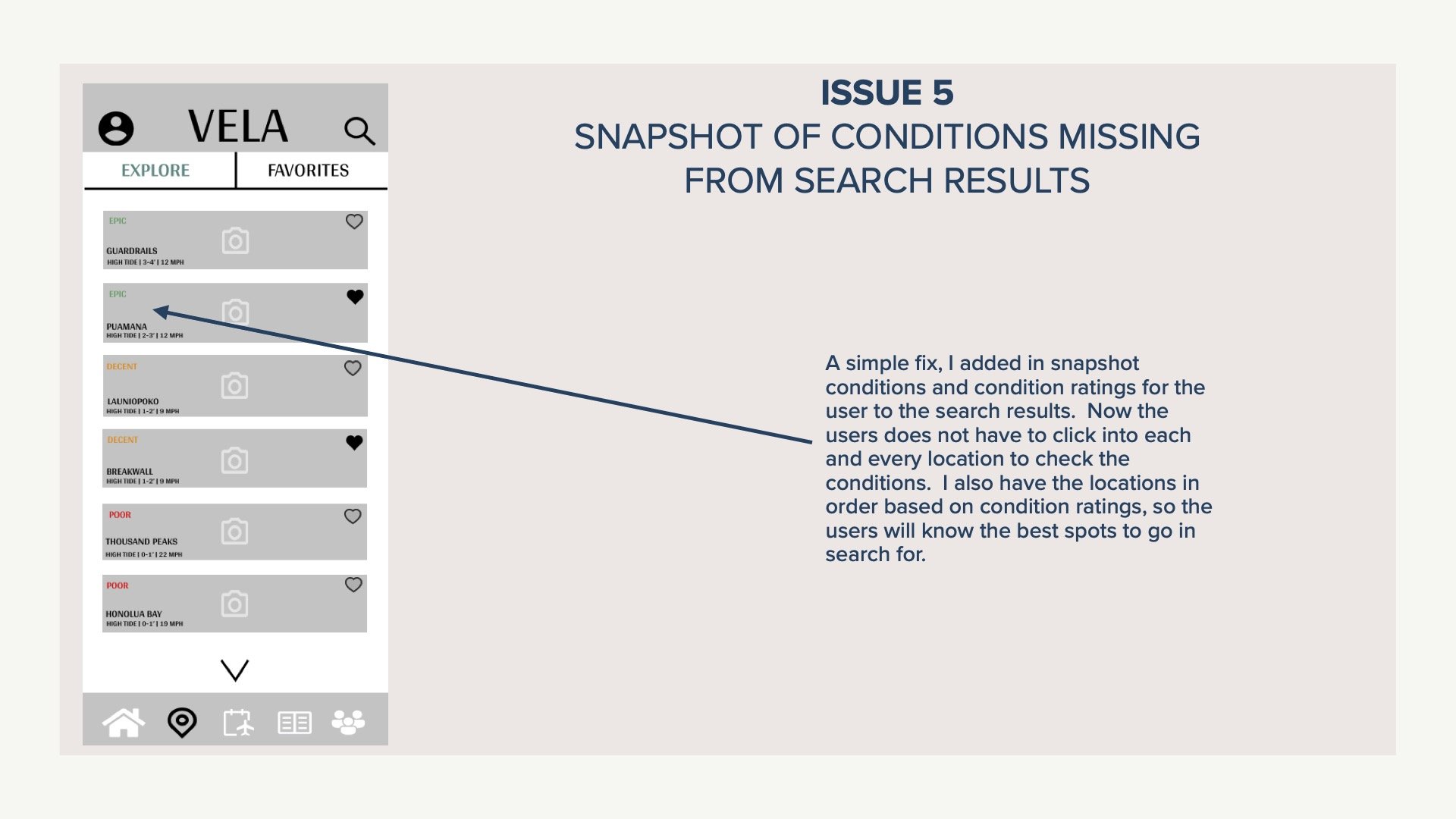
There were several issues within the app that came about from usability testing, but the highest severity issue was the layout and functionality of the Search Locations page, issues 2 and 3. Users were very confused by the layout and the best way in which to navigate the task asked of them. Due to this I completely revised the Search Location page to have better usability for the users.
Take a look at the 5 issues that came about during this process and how I resolved them below by scrolling through the images below.
Design Iteration
Invariance
I took the idea of adding invariance to the Vela logo from a wind, wave and weather competitor logo. Magic Seaweed’s logo (MSW), turns the S sideways to give the users a different perspective as a wave. Using the triangle shape to create the V and the A in Vela, gives the logo a standout look for users that will be remembered. There is concern that the V and A will not be easily established to every viewers eye, so I plan on doing a little more usability testing on this new logo.
Good Continuation
Adding in a carrot next to the water activity icons allows users to understand that there are more options available to them if needed by clicking on that element. This helps direct the user to understand their options.
Emphasis
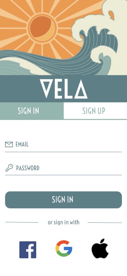
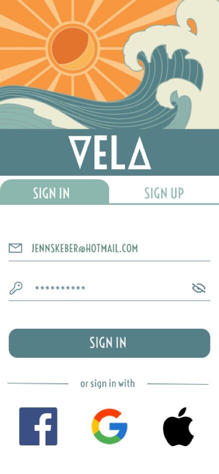
After my preference test results for my introduction screen yielded an overwhelming response in favor of social media icons as opposed to text call to action, I knew there was more emphasis that I could place on the sign in and sign up areas of this screen as well. I made sure to really emphasize the Sign In button by having it be the same color background as the logo at the top. Ensuring those 2 elements were what users were drawn to first on this screen.
Balance
While my last draft of the Homepage had some good balance elements in place, I knew there were some improvements that I could make to really balance out the middle of the screen. By utilizing colored rectangles to separate the weather data and the recommendations, it balances out the middle of the home screen a lot better. The water activity selection icons at the top help balance out the weather forecast at the bottom of the page as well.
Splash Page
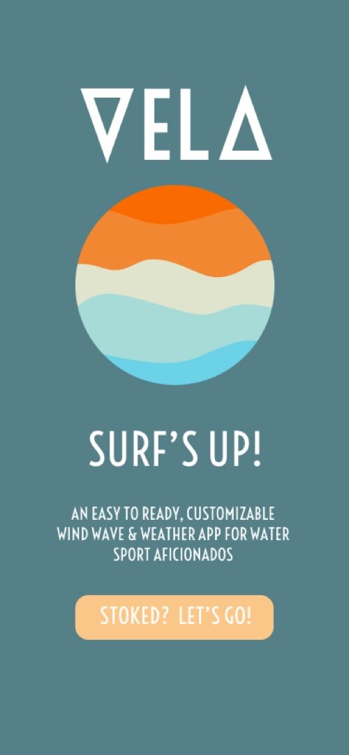
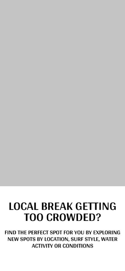
The splash page of VELA had some minimal changes throughout the design process, the biggest coming from the mid-fidelity prototype to the high-fidelity. After the design collaboration portion of the design process, I added in a brief description of the app on this page to help the users see what the app was designed to do.

LOW | MID FIDELITY

HIGH-FIDELITY
FINAL DESIGN
Login | Create Account
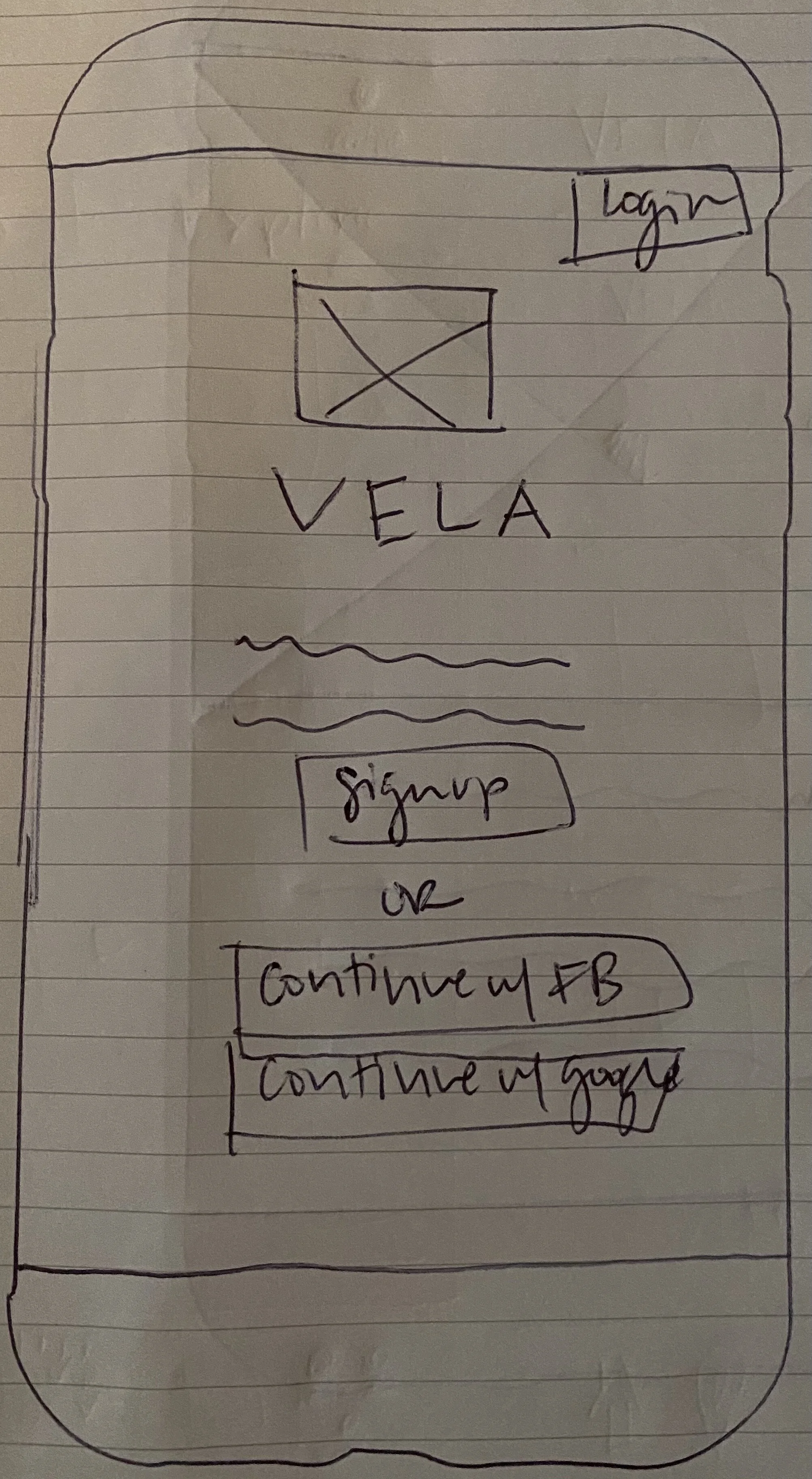
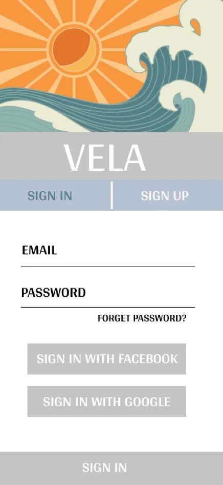
I haven’t had many changes to the login / create account pages during the high-fidelity stage of the design process. I added in the ability to type in the email and password, and a few icon adds, but for the most part the design of these pages has staying on par with the mid- fidelity mock-up with some UI tweaks to polish the design off.
LOW FIDELITY
MID FIDELITY
HIGH FIDELITY
FINAL DESIGN
Onboarding
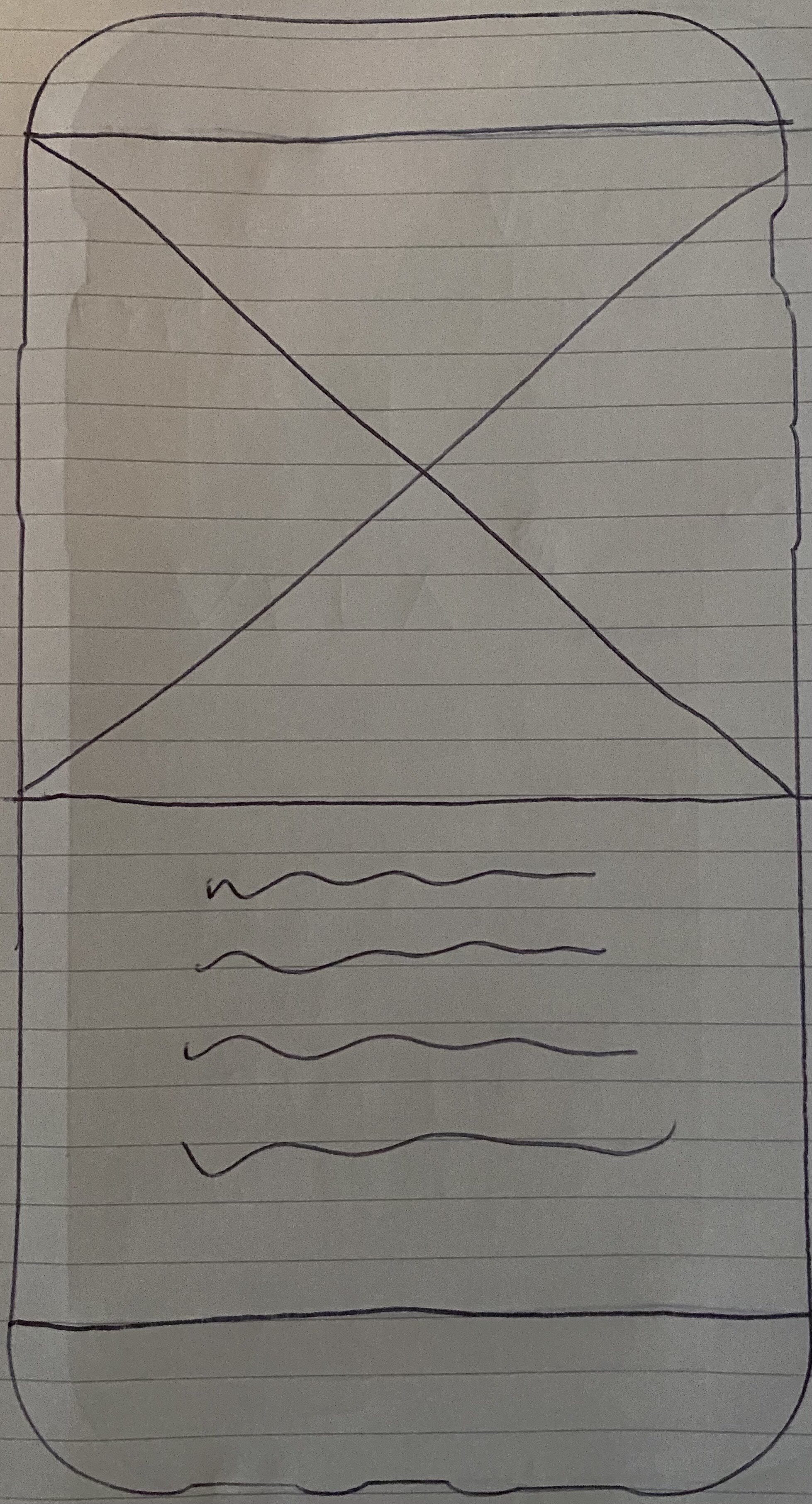
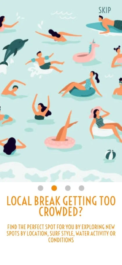
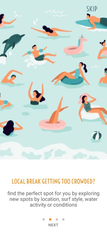
Onboarding screens have a pretty simple concept across the board, but I knew from the beginning I wanted to design of these screens to be simple and effective in communicating and highlighting some of the apps features that make it stand apart from the competitive apps available to users. The final design of these screens have finessed UI components, with placement of the scroll icons and the addition of Next for those that don’t scroll.
LOW FIDELITY
MID FIDELITY

HIGH FIDELITY
HIGH FIDELITY
FINAL DESIGN
Homepage | Dashboard
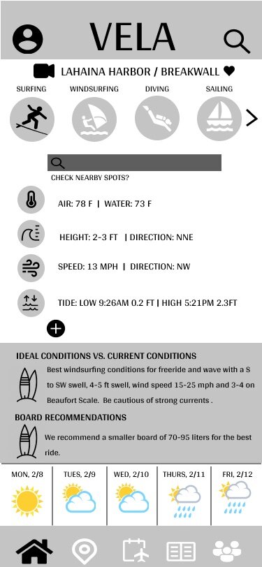
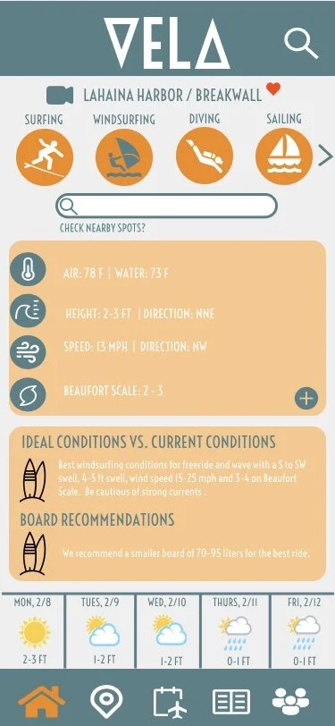
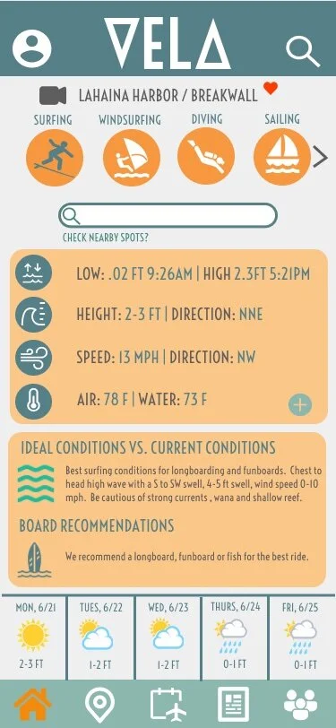
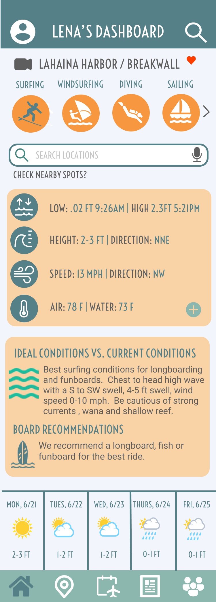
The homepage / user’s personalized dashboard has gone through some significant UI changes since the mid-fidelity phase of the design process, however the overall concept and functionality of the homepage has not changed much, as the feedback received early on was positive in that respect. The largest improvements have been in this past final stage of design, as I received feedback that there was a bit too much information on the screen and it was overwhelming and hard to read for the user. Extending the screen view significantly improved the overall feel and usability of this page. This was where font size and color contrasting fixes were made as well, which finessed the overall visual appeal of the app.

LOW FIDELITY

MID FIDELITY
MID FIDELITY
HIGH FIDELITY
HIGH FIDELITY
FINAL DESIGN
Search Landing
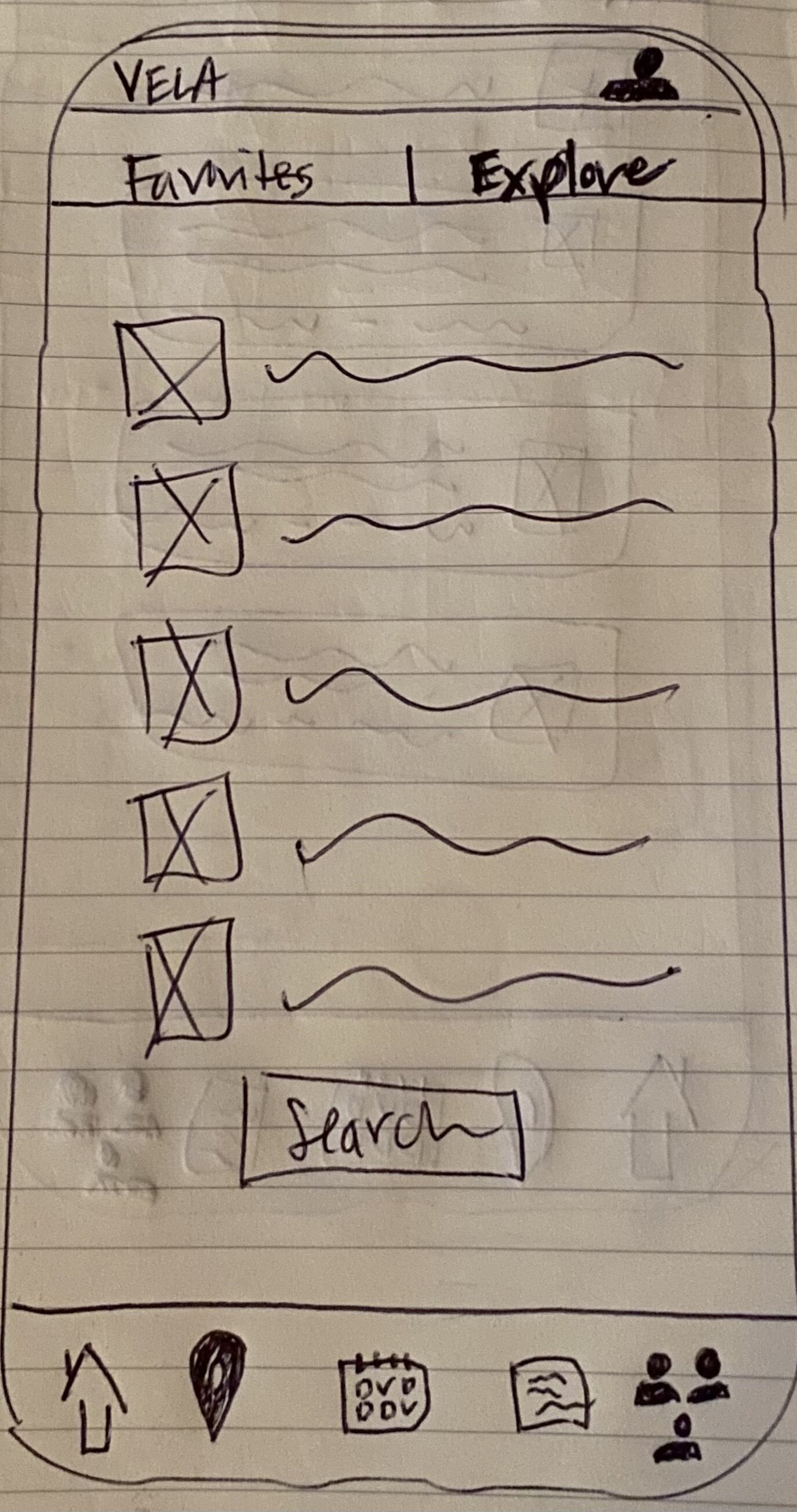
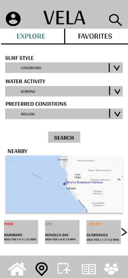
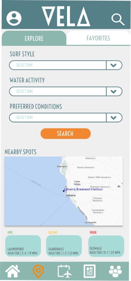
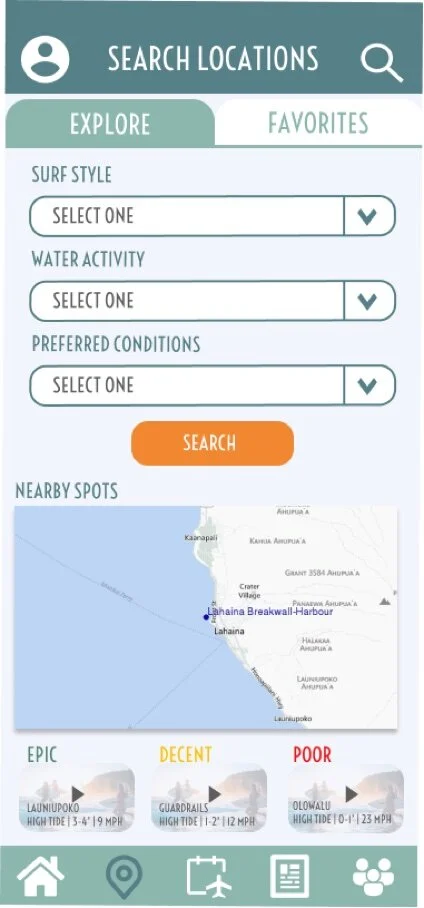
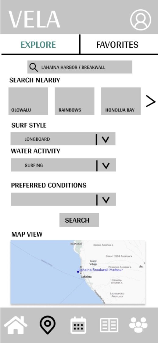
The search landing page went through a significant revision in the mid-fidelity stage. There was a lot of user confusion as to what the search filters were and the placement of the map compared to the search nearby icons. After rearranging the screen, the user feedback greatly improved and the usability of this screen was significantly better. Separating the filter options with the map/ close locations at the bottom helped users know that you could search for a location using multiple ways or methods of their choice. Some UI changes were made in the high-fidelity and finalized stages, but the overall layout has not changed since mid- fidelity.
LOW FIDELITY

MID FIDELITY
MID FIDELITY
HIGH FIDELITY
FINAL DESIGN
Filtered Search
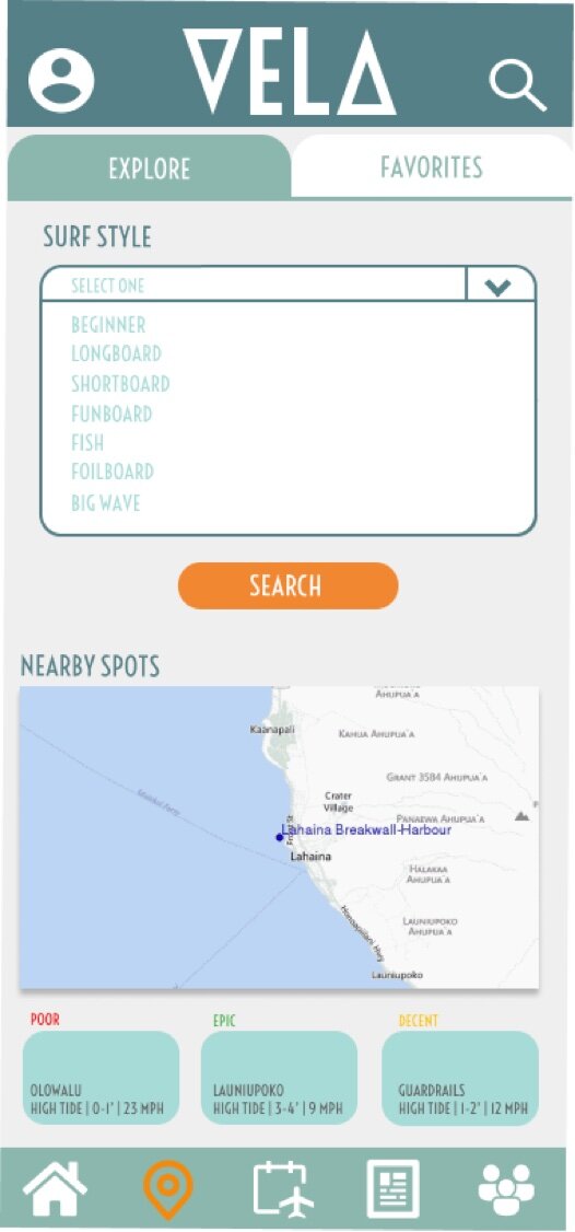
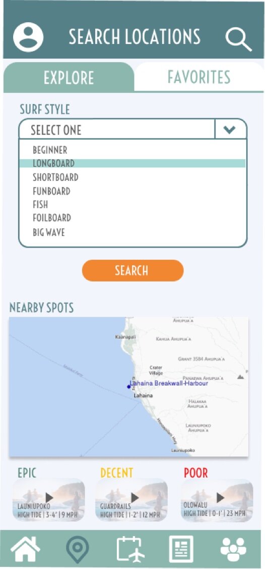
Similar to the search landing page, the filtered search pages were not even created until the high-fidelity phase. Here is when I added the pull-down filter options for the user, with the biggest color contract change made with the text from aqua to grey. This allows users to see the filter options much more and the aqua highlight shows the user what is currently selected, making this feature more usable.
MID FIDELITY

MID FIDELITY
HIGH FIDELITY
FINAL DESIGN
Search Results
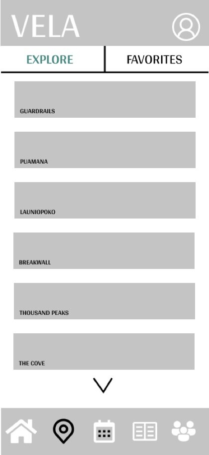
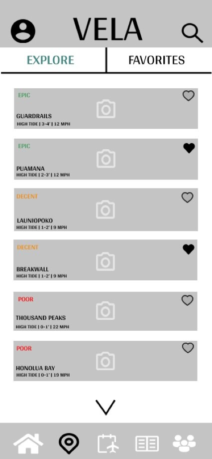
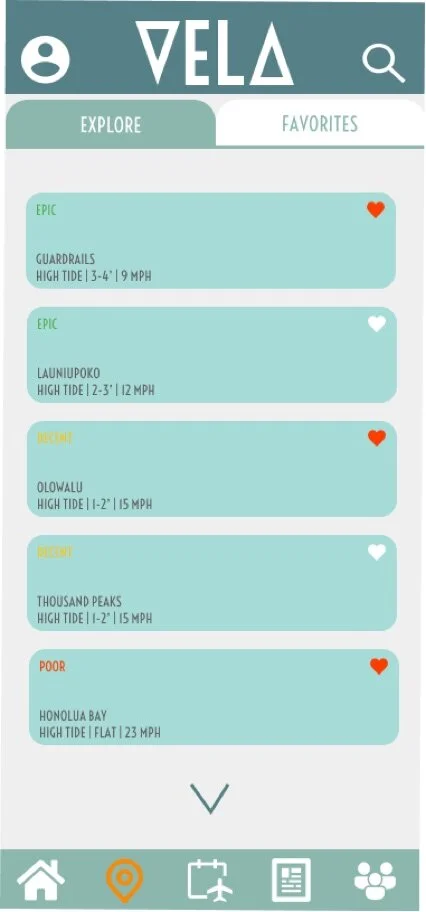
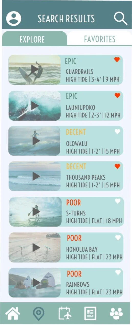
The search results page has a fairly simple concept in that it would just list all the results in for the user. One change made based on user feedback was the list the results in order of best to worst conditions for the user to see what the best spots were at the top. I thought this was great feedback in improving the usability, especially for users that were more novice users. The finalized version is also an expanded screen instead of the arrow to show the users there are more if they scroll. This was a minor change, but one that helps the visual appeal of the app more. The addition of the surf cam videos on this page also allows the user ease of use, as it eliminates a click to the locations page in order to view the surf cam footage. This way the user can check conditions of several locations without having to navigate back and forth.

LOW FIDELITY
MID FIDELITY
MID FIDELITY
HIGH FIDELITY
FINAL DESIGN
Design Language System
In order to streamline the design process, I created a design language system document for VELA. This ensures that the UI design elements that were put in place are used through any changes that VELA will go through in the future and help eliminate any irregularities.
01 Colors
VELA’s primary colors and secondary colors, consisting of different hues of blues and oranges, are meant to represent where the ocean meets the sunset sky. Chosen for being fun and confident, orange hues are meant to excite the user and give them the confidence to read and interpret the data presented. Blue is a trustworthy color, which is important in regards to the user trusting the data that is presented is accurate.
Primary colors are used to highlight the main aspects of the features; the navigation bar, header bar of the app, the water activity selections, and the weather data presented. Secondary colors are for use as card colors, with #FBC688 as an alternative for the large cards and #A7DBD7 as small cards. Background color is always #EFEFEF in order to showcase the white accents throughout the app. The red, yellow and green colors are to only display poor, decent, and epic conditions to the user.
02 Typography
Voltaire Regular was chosen for it’s semi-geometric style that can easily be read as smaller and larger text. This is the main text for the VELA app and desktop version, with Robato only be used for any body text content. Text colors are to only be composed of #558087 and #5E5E5E for Headings 1, 2 and 3. Body text should consist of #5E5E5E when on large cards that are color #FBC688 and #FFFFFF when on any cards composed of #558087. Always ensure your body text color is contrasting the color of the cards.
Heading 1 should be used to display weather data, current location selection and headings on cards. Heading 2 should be used to display the water activity options, with Heading 3 being used to display the weather forecast. Weather data should never consist of body text, even though it is presented in a card format, as this is one of the apps main functions and needs to be highlighted.
03 UI Elements
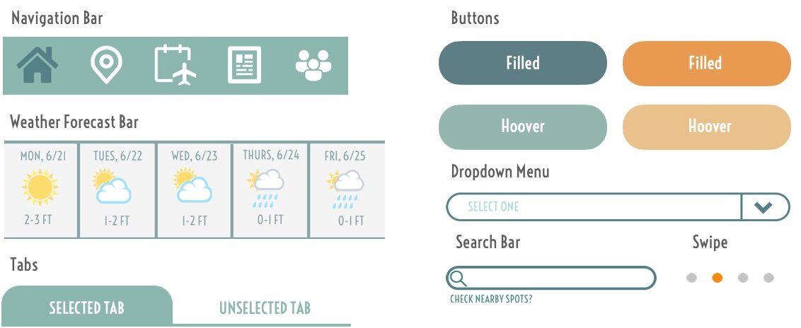
Navigation Bar
Navigation bar should be at the bottom of every page throughout the app, allowing the user to easily switch tasks. The selected or current page the user is on should be in color #F38631 with all other icons in white. Icons are located as follows from left to right, Home, Search, Trip Planner, Guides, Community.
Weather Forecast Bar
Weather forecast bar should be a live forecast tool for the user that displays the next 5 days of weather for the user as a quick guide. Clicking on a particular date will bring the user to a more detailed forecast for that day.
Tab
Used to display various selections within a page, the tab element should be highlight in color #8CB7AE to let the user know what selection they are currently on. Used during the sign-in/login process on the mobile design and as the menu navigation tool on the desktop version. This element is also to be used on the Search tab to display the Explore and Favorite tabs for users.
Buttons | Swipe
All buttons should be in one of the 4 primary colors when being a call to action button, such as Search or Login. Secondary colors should be used when the user hoovers over the button before selecting.
The swipe element is to be used during the onboarding process to help the user distinguish a visual on the number of screens available to view. This feature should also be used within the Guides page for users to swipe for guide options once they have selected a category.
Search Bar
Search bar will be located as a bar option on the users homepage for them to quickly search for a particular location. There will also be a search icon at the top header of each page within the app to allow the user to search the app for any data the wish to find.
Dropdown Menu
Dropdown menu element is used on the Search page as a filter option for users to selection from several options within the search filter bar. As most users will be novice users, VELA will only give pre-selected options for the user to select from.
04 Iconography
VELA utilizes a large variety of icons to give visual representation to all of the weather and water sport data within the app. All water activity icons should be within a circular shape and in color #FFFFFF when not selected, mimicking the navigation bar at the bottom of the mobile design. Selected water activity icons should be in color #558087.
Weather data icons should also be placed within a circular shape that is within a large card element. The circular shape should always be #558087 with the icons in color #FFFFFF.
A video icon should appear next to the location within the homepage and search pages of the mobile design to alert the user of a surf cam or video option for that location. On the opposite side of the location text, a heart icon is available for the users to easily select or unselect a location as a favorite.
There should be a water icon placed within the Ideal Conditions vs. Current Conditions card element to help the user easily see if a location with the selected water activity of their choice, currently has Poor, Decent or Epic conditions to go out in. This is to help users that do not fully understand the data present to easily see if they are able to participate in a water activity.
There are several other icons throughout the app, such as password, email and profile icons to help the user navigate easily. Simple colored weather icons can be found in the weather forecast bar element as well.
05 Images | Illustrations
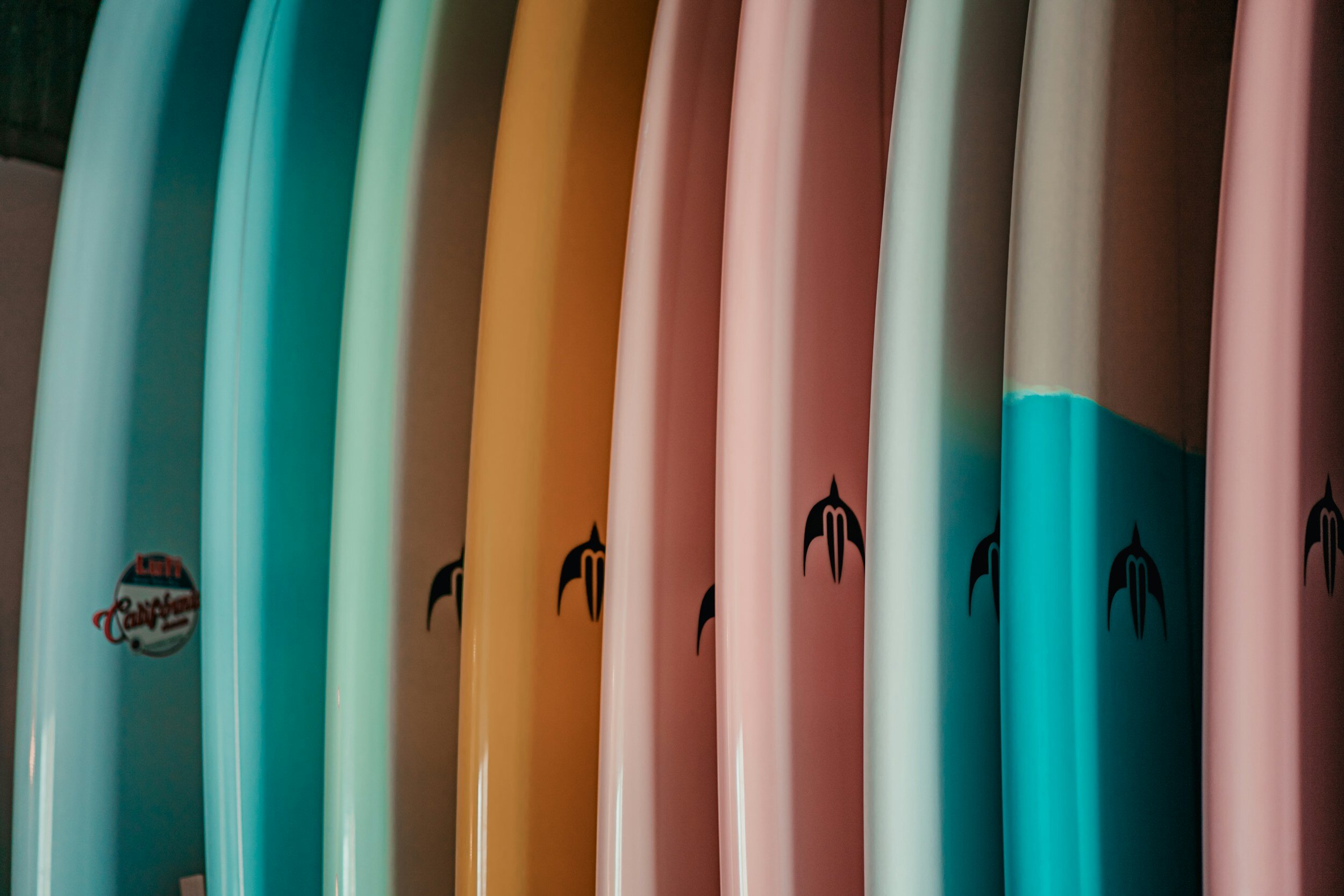
Any imagery that is not related to video or photography elements within the app shall maintain a fun, retro surf vibe that compliments the apps color hues and scheme. The images above are examples of what should be used during the onboarding process, to give the app a fun lighthearted feel during the users first time using the app. The VELA logo shall always maintain a color of of #FFFFFF throughout the app, as it is always placed on the top menu bar of the mobile and desktop version. To the left is an example of what the onboarding screens should look like. Notice that while the illustration incorporates a variety of colors outside of the app’s color hues, it incorporates hues of blues and oranges and mimics the apps fun vibe.
06 Copy | Language
Planning a day on the water should be informative and fun, and the tone of VELA should be that as well. Weather data can be intimidating and overwhelming, so language should be catchy, fun and straightforward. Surf phrases such as “Surf’s up!”, “Time to get barreled”, etc. are to be used throughout the app to remind the user that a day on the water shouldn’t be stressful. Keep it lighthearted!
Weather data information should be short, sweet and to the point. VELA is designed to inform users of the data they need to make informed decisions on the water in a visually appealing and easy manner. VELA is not designed to provide users with full in-depth detailed wind, wave and weather details, as a large base of our target market are novice users.

Vela Final Prototype
Explore and navigate your way through the wind, wave and weather app.
Vela Prototype Video
A brief tutorial of how to navigate your way through the wind, wave and weather app.
Mahalo for viewing the Vela Case Study!


